
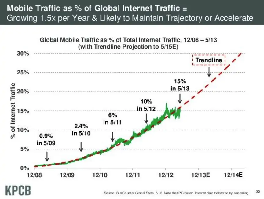
For the most part, our attention has been squarely focused on building an ecommerce website and attracting attention, through a combination of search, paid and other marketing methods. But to ignore mobile in all of this would be to fail to acknowledge both the present and the future of ecommerce. People now use mobile and tablet devices to browse and shop online – not only as an add-on, when they can’t get to their computer, but as their primary device.
As anyone who has ever tried to get stuff done online on a mobile platform, not every website just neatly presents in mobile formats, and your customers will be quick to head elsewhere if your website isn’t mobile-ready. If you want to capitalise on the number of users buying on mobile and tablet devices, you need to think about optimising your buying experience for them too, and providing responsive designs and apps that fit with their browsing needs.
Source: www.kunocreative.com
The Differences Between Mobile and Desktop
Mobile is no longer a fringe source of traffic. It is now one of the major ways people buy online, and you can’t rely on your current ecommerce design to always deliver the goods.
Screens present differently, browsers present differently, and users interact with the web differently on mobile and tablet designs. Most people work around this by presenting mobile and tablet users with a separate version of their website, optimised for mobile devices.
There are a few things to bear in mind when thinking about presenting your website on mobile.
- Buttons Need To Be Bigger: quite simply, your buttons and menus need to be bigger and more spaciously laid out. A finger tap is always less precise than the click of a mouse, and you don’t want customers accidentally missing the buy button and opening up other windows on their mobile, virtually killing the sale stone dead. Leave plenty of space around your buttons and make them big and easy to press, so you’re not restricting your customers’ ability to buy from your site.
- The Fold Has Moved: your ‘above the fold’ considerations will have changed on mobile. For most purposes, this will mean you have more space to play with, but depending on page orientation you may be playing with less. Make sure everything you want to be above the fold on your homepage, category pages and product pages still stay that way when you view your website on mobile.
- Page Orientation: The page orientation issue is one that may require some design tweaks. You want your page to present well on the horizontal as well as the vertical orientation, so customers can still buy your products regardless of the dimensions and orientation of the device they are using.
Responsive Mobile Ecommerce
Responsiveness is a key element of design, and you should be on the lookout for responsive themes or designers when you are putting together your ecommerce store. Responsive websites adjust to fit the different dimensions of the various devices people might use to access your site. This prevents your pages from requiring scrolling or manual resizing, and even means you can present the same version of your website to users across a multitude of devices.
Responsiveness means you don’t have to create different versions of your website for the slightly variant specifications of smartphones and tablets your customers might conceivably use to access your website. Yet, if you ignore these users, you are cutting out a huge percentage of your traffic and ultimately sales.
A responsive theme or design from the outset will leave you in the strongest position when it comes to handling mobile traffic, and will mean you don’t need to opt for several different variations of your website to ensure you have all the bases covered.
Responsive vs. Adaptive Design
Responsive design is the standard, and those in the design community tend to favour a responsive approach because it leads to less difficulty in handling alternative traffic formats. A responsive design is as good on mobile as it is on desktop, and it doesn’t matter which device you end up using to view your site. Responsive design allows you to put content at the heart of your site, whatever the viewing experience, without cutting off double-digits percentages of your traffic.
Which solution is better for your mobile website?
| Feature | trust | conversion | seo | sharing | aov | info | sticky | £ saving | nav | |
|---|---|---|---|---|---|---|---|---|---|---|
| 1 | Product Description Text | 3 | 5 | 5 | 2 | 0 | 5 | 0 | 0 | 0 |
| 2 | Product Reviews | 3 | 2 | 3 | 2 | 0 | 4 | 2 | 3 | 0 |
| 3 | Price (+ options, inc / ex vat) | 0 | 0 | 0 | 0 | 0 | 0 | 0 | 0 | 0 |
| 4 | Prominent Buy button | 0 | 2 | 0 | 0 | 0 | 0 | 0 | 0 | 0 |
| 5 | Product zoom / enlarge | 3 | 1 | 0 | 0 | 0 | 5 | 0 | 0 | 0 |
| 6 | Additional product images | 4 | 2 | 1 | 0 | 0 | 5 | 0 | 0 | 0 |
| 7 | Product videos | 4 | 2 | 3 | 2 | 0 | 5 | 0 | 0 | 0 |
| 8 | User photos / videos | 2 | 2 | 1 | 3 | 0 | 4 | 1 | 2 | 0 |
| 9 | Stock status | 2 | 1 | 0 | 0 | 0 | 2 | 0 | 2 | 0 |
| 10 | Last In Stock warning | 1 | 3 | 0 | 0 | 0 | 3 | 0 | 0 | 0 |
| 11 | Order within the next X hours & X minutes for delivery on [date]' | 0 | 3 | 0 | 0 | 0 | 1 | 0 | 0 | 0 |
| 12 | Like on facebook/twitter | 0 | 0 | 1 | 3 | 0 | 0 | 1 | 0 | 0 |
| 13 | Follow us on twitter/facebook/insta | 2 | 0 | 1 | 2 | 0 | 2 | 0 | 0 | 0 |
| 14 | Buy this product with these other products for XX bundling | 0 | 1 | 0 | 0 | 2 | 1 | 0 | 0 | 1 |
| 15 | Complementary cross-sell products | 0 | 1 | 0 | 0 | 3 | 1 | 0 | 0 | 1 |
| 16 | More expensive similar product 'up-sells' | 0 | 0 | 0 | 0 | 2 | 1 | 0 | 0 | 1 |
| 17 | Cheaper model 'down-sells' | 0 | 2 | 0 | 0 | -1 | 1 | 0 | 0 | 1 |
| 18 | Add to wishlist option | 0 | 0 | 0 | 1 | 0 | 0 | 3 | 0 | 1 |
| 19 | Include 'you may want to buy this instead' when out of stock. | 0 | 3 | 1 | 0 | 0 | 2 | 0 | 0 | 2 |
| 20 | Phone number for telephone orders | 3 | -1 | 0 | 0 | 1 | 1 | 0 | -2 | 0 |
| 21 | Different phone numbers for multi-channel tracking | 0 | 2 | 0 | 0 | 0 | 0 | 0 | 0 | 0 |
| 22 | Save £/$/€X' / 'Save X%' on reduced products | 0 | 2 | 0 | 1 | 0 | 2 | 0 | 0 | 0 |
| 23 | A 'size guide' to all clothing items | 2 | 4 | 0 | 0 | 0 | 4 | 0 | 3 | 0 |
| 24 | Add on product recommendations after 'add to bag' used | 0 | 1 | 0 | 0 | 2 | 2 | 0 | 0 | 0 |
| 25 | Size notes (eg. 'fits small') | 4 | 3 | 0 | 0 | 0 | 4 | 3 | 3 | 0 |
| 26 | Material information (for clothing) | 2 | 1 | 0 | 0 | 0 | 2 | 0 | 2 | 0 |
| 27 | Care instructions (for clothing) | 1 | 0 | 0 | 0 | 0 | 1 | 0 | 2 | 0 |
| 28 | Colour chooser | 0 | 2 | 0 | 0 | 0 | 1 | 0 | 2 | 0 |
| 29 | Currency conversions | 2 | 1 | 0 | 1 | 0 | 2 | 0 | 2 | 0 |
| 30 | Product ingredients list (for food) | 2 | 1 | 1 | 1 | 0 | 2 | 0 | 1 | 0 |
| 31 | Allergy/preference information (for food) | 2 | 1 | 1 | 1 | 0 | 2 | 0 | 1 | 0 |
| 32 | Call me about this product button | 2 | 1 | 0 | 0 | 0 | 2 | 2 | -1 | 0 |
| 33 | Click to chat button | 3 | 3 | 0 | 0 | 2 | 3 | 0 | -1 | 0 |
| 34 | Add a 'seen a mistake on this page?' link to kill off errors | 2 | 1 | 0 | 0 | 0 | 1 | 0 | 2 | 0 |
| 35 | Upload your own photo' link | 2 | 0 | 1 | 2 | 0 | 2 | 2 | 2 | 0 |
| 36 | Sales rank / best-seller rank | 1 | 2 | 0 | 0 | 0 | 2 | 0 | 0 | 0 |
| 37 | Tags / Add tags | 0 | 1 | 2 | 0 | 0 | 2 | 0 | 0 | 3 |
| 38 | Breadcrumb trail | 1 | 1 | 2 | 0 | 0 | 1 | 0 | 0 | 4 |
| 39 | Links to related blog posts / articles / product guides | 2 | 0 | 1 | 3 | 0 | 3 | 3 | 0 | 1 |
| 40 | Quantity selector | 0 | 0 | 0 | 0 | 2 | 0 | 0 | 0 | 0 |
| 41 | Product Code | 2 | 0 | 2 | 0 | 0 | 1 | 0 | 0 | 0 |
| 42 | Bullet Point features | 1 | 3 | 2 | 0 | 0 | 4 | 0 | 0 | 2 |
| 43 | Customers who bought this also bought... | 1 | 2 | 1 | 0 | 4 | 1 | 0 | 0 | 3 |
| 44 | Add an age guide to kids products | 3 | 1 | 0 | 0 | 0 | 2 | 0 | 2 | 0 |
| 45 | Product dimensions | 1 | 1 | 0 | 0 | 0 | 2 | 0 | 2 | 0 |
| 46 | New' message on new products | 1 | 1 | 0 | 0 | 0 | 2 | 2 | 0 | 1 |
| 47 | Finance options | 1 | 1 | 0 | 0 | 1 | 0 | 0 | 0 | 0 |
| 48 | Warranty information | 4 | 2 | 0 | 0 | 0 | 2 | 0 | 0 | 0 |
| 49 | Additional warranty options | 1 | 0 | 0 | 0 | 4 | 0 | 0 | 0 | 0 |
| 50 | Text ads to other sites / non-competing partners | 0 | 0 | 0 | 0 | 0 | 0 | 0 | 2 | 0 |
| 51 | Rich Snippet: Product Info, Review info, Video info, etc | 0 | 2 | 4 | 0 | 0 | 1 | 0 | 0 | 0 |
| 52 | Display ads to other sites / non-competing partners | 1 | -1 | 0 | 0 | 0 | 0 | 0 | 2 | 0 |
| 53 | A 'view more from this brand' link (eg. more Canon products) | 0 | 0 | 2 | 0 | 0 | 0 | 0 | 0 | 2 |
| 54 | A 'view more from this category' link (eg. more SLRs) | 0 | 0 | 2 | 0 | 0 | 0 | 0 | 0 | 2 |
| 55 | A 'view more from this brand/category' link (eg. more Canon SLRs) | 0 | 0 | 3 | 0 | 0 | 0 | 0 | 0 | 2 |
| 56 | A link to 'other products in this offer' for promotions | 1 | 2 | 0 | 0 | 0 | 2 | 0 | 0 | 0 |
| 57 | Product brand logo | 2 | 0 | 0 | 0 | 0 | 1 | 0 | 0 | 0 |
| 58 | 360 degree product view | 4 | 2 | 0 | 0 | 0 | 5 | 0 | 0 | 0 |
| 59 | Points Earned if you have a loyalty program | 1 | 1 | 0 | 0 | 1 | 0 | 3 | 0 | 0 |
| 60 | Tell me when this product comes into stock (for out of stock products) | 1 | 3 | 0 | 0 | 0 | 2 | 3 | 0 | 0 |
| 61 | Collect at store info / postcode entry | 3 | 3 | 0 | 0 | 0 | 1 | 0 | 2 | 0 |
| 62 | Assembly instructions for kit products | 1 | 1 | 1 | 0 | 0 | 3 | 0 | 0 | 0 |
| 63 | Compatibility information | 1 | 2 | 1 | 0 | 0 | 3 | 0 | 0 | 0 |
| 64 | Bookmark this page | 0 | 0 | 0 | 0 | 0 | 0 | 1 | 0 | 0 |
| 65 | Print this page | 0 | 0 | 0 | 1 | 0 | 3 | 0 | 0 | 0 |
| 66 | Customer-friendly translations (eg 'holds 7,000 songs' as well as '32GB') | 2 | 4 | 1 | 0 | 0 | 3 | 0 | 0 | 0 |
| 67 | Shipping time estimate | 3 | 3 | 0 | 0 | 0 | 2 | 0 | 0 | 0 |
| 68 | Shipping weight | 0 | 0 | 0 | 0 | 0 | 2 | 0 | 0 | 0 |
| 69 | Product weight | 0 | 0 | 0 | 0 | 0 | 2 | 0 | 0 | 0 |
| 70 | Storage instructions | 0 | 0 | 0 | 0 | 0 | 2 | 0 | 0 | 0 |
| 71 | Country of origin | 1 | 0 | 0 | 0 | 0 | 2 | 0 | 0 | 0 |
| 72 | Battery requirements | 0 | 0 | 0 | 0 | 0 | 2 | 0 | 0 | 0 |
| 73 | Energy rating / Environmental notes | 2 | 1 | 0 | 0 | 0 | 2 | 0 | 0 | 0 |
| 74 | Unique Selling Points of Product / Brand | 0 | 2 | 1 | 0 | 0 | 2 | 0 | 0 | 0 |
| 75 | Free Delivery on orders over X | 1 | 3 | 0 | 0 | 3 | 1 | 0 | 0 | 0 |
| 76 | Size conversion chart (for international orders on clothing/footwear) | 1 | 2 | 0 | 0 | 0 | 2 | 0 | 0 | 0 |
| 77 | Recipes including the product (for food) | 1 | 2 | 3 | 0 | 0 | 2 | 0 | 0 | 0 |
| 78 | How-To guides for product use | 2 | 2 | 3 | 0 | 0 | 3 | 0 | 0 | 0 |
| 79 | Cross-sells by colour / other attributes | 0 | 1 | 0 | 0 | 0 | 1 | 0 | 0 | 2 |
| 80 | Price per X (eg per kg for food items) | 0 | 2 | 0 | 0 | 0 | 2 | 0 | 0 | 0 |
| 81 | Recently viewed items | 0 | 1 | 1 | 0 | 0 | 2 | 0 | 0 | 3 |
| 82 | Rental cost (eg. For technical equipment that can be bought/leased) | 1 | 1 | 0 | 0 | 2 | 2 | 2 | 0 | 0 |
| 83 | Link to the next/previous products in your product catalogue | 0 | 0 | 0 | 0 | 0 | 0 | 0 | 0 | 2 |
| 84 | Customers who view this ultimately buy [x] | 0 | 2 | 0 | 0 | 0 | 2 | 0 | 0 | 2 |
| 85 | Upload your own video | 1 | 1 | 1 | 2 | 0 | 1 | 0 | 0 | 0 |
| 86 | Add your own post / notes (ugc) | 0 | 0 | 1 | 0 | 0 | 1 | 0 | 0 | 0 |
| 87 | Nutritional information (on food products) | 3 | 0 | 0 | 0 | 0 | 0 | 0 | 0 | 0 |
| 88 | Gift Wrap options | 0 | 1 | 0 | 0 | 1 | 0 | 0 | 0 | 0 |
| 89 | Customisation notes (eg. 'Free Engraving...') | 1 | 2 | 0 | 0 | 0 | 3 | 0 | 0 | 0 |
| 90 | Customer service responses to questions | 2 | 2 | 3 | 0 | 3 | 0 | 0 | 3 | 0 |
| 91 | Time left until offers run out | 0 | 3 | 0 | 1 | 0 | 1 | 1 | 0 | 0 |
| 92 | Awards the product has won | 3 | 2 | 0 | 0 | 1 | 1 | 0 | 0 | 0 |
| 93 | Customer testimonials | 2 | 2 | 0 | 1 | 0 | 1 | 0 | 0 | 0 |
| 94 | Comments | 3 | 4 | 2 | 2 | 0 | 3 | 2 | 0 | 0 |
| 95 | Facebook Comments | 1 | 1 | 0 | 4 | 0 | 2 | 1 | 0 | 0 |
| 96 | Number of tweets/likes/+1s | 1 | 0 | 0 | 4 | 0 | 1 | 1 | 0 | 0 |
| 97 | Checkout with Paypal button | 3 | 4 | 0 | 0 | 0 | 0 | 0 | 0 | 0 |
| 98 | Catalogue product code (to reference items) | 0 | 2 | 0 | 0 | 0 | 2 | 0 | 1 | 2 |
| 99 | Product stats (sales, pageviews, etc) | 3 | 2 | 0 | 0 | 0 | 2 | 0 | 0 | 0 |
| 100 | A Johnson box (usp box showing key USPs for the brand) | 2 | 2 | 0 | 0 | 0 | 0 | 0 | 0 | 0 |
| 101 | Product release date | 1 | 1 | 0 | 0 | 0 | 2 | 1 | 0 | 0 |
| 102 | Pre-order for out-of-stock / forthcoming products | 0 | 2 | 0 | 0 | 0 | 1 | 3 | 2 | 0 |
| 103 | Sell this product (for marketplaces) | 0 | 1 | 0 | 0 | 0 | 2 | 1 | 1 | 0 |
| 104 | Price promise | 3 | 2 | 0 | 0 | 0 | 1 | 0 | 0 | 0 |
| 105 | Virtual try-on | 1 | 1 | 0 | 0 | 0 | 3 | 0 | 0 | 0 |
| 106 | Product negatives / reasons not to buy | 3 | 2 | 0 | 1 | 2 | 4 | 0 | 2 | 0 |
| 107 | Review sorting / search | 3 | 3 | 0 | 0 | 0 | 0 | 0 | 0 | 0 |
| 108 | Reviewer information | 3 | 2 | 0 | 0 | 0 | 3 | 0 | 0 | 0 |
| 109 | As seen on / used by / worn by | 2 | 2 | 0 | 2 | 0 | 3 | 0 | 0 | 0 |
| 110 | Email Signup call to action | 0 | 0 | 0 | 0 | 0 | 0 | 5 | 0 | 0 |
Adaptive design is the next best thing, where responsive design isn’t a possibility. This might be where you already have a non-responsive website in place, and you’re not heading for a full redesign. Adaptive is, as the name implies, adapting your current web design to fit with different devices, rather than hard-wiring responsiveness into your structure. It can be slightly more cumbersome to setup, in the sense that you will need multiple designs for different screens and devices. However, this is often easier than trying to make a non-responsive design responsive, and most would advocate either starting your design again or switching to an adaptive approach if you find yourself in this boat.
Alternatively, you can serve up a much more feature-light experience for those viewing your content on tablet and mobile devices, and it might be the case you can get away with this lower-level adaptive design. Whichever format you choose, one things remains certain – that to mistreat mobile traffic now is crazy, and that to mistreat mobile traffic into the future is akin to business suicide.
Creating Apps
If you are serious about building a framework for your mobile and tablet users to buy from your site, it may be worthwhile developing apps which can be used to buy from your website directly. Apps can provide a more customised experience for users, and rather than channelling through various different mobile versions of your website, breaking down your catalogue into manageable apps for both Android and iPhone users can help you reach a wider audience in a way that is suitable to them.
Apps can provide a better user experience, without the need to navigate through a mobile web browser. Instead, customers can simply fire up the app and start making purchases through your store – perfect for encouraging your regular customers to shop more easily (and hopefully more frequently), and for avoiding the user hassle of navigating through the browser.
There are services available which allow you to develop apps using your existing website, often requiring just a small cost for you to use the app as your own. Alternatively, you can outsource app development to a coder with particular expertise in the field. Freelancing sites like oDesk and Freelancer.com can help you get the job done for a fraction of what you might pay a large agency – if you can find a seemingly reputable supplier within your budget (ask to see examples of their previous work), you can save yourself a fortune.
When developing an app for your site, you will need at least two different apps – one for Android OS devices, and one for iOS. If you can only afford one app to begin with, choose Android – there are way more devices running Android platforms than there are on iOS.
Creating Mobile Websites With Mobify
Mobile traffic is clearly, at the very least, here to stay, and the need to focus your efforts on improving the mobile shopping experience are growing ever-greater. Mobify is a service which helps companies optimise their website for mobile traffic specifically, delivering insights into mobile users and their interaction with your website as-is. This makes it possible to gradually optimise your mobile buying experience, making sure your ecommerce store is capitalising on all the traffic it attracts.
Striving for a ‘mobile mature’ ecommerce store delivers benefits in the here and now, as well as ensuring you are well placed for the mobile years to come. As even more people switch to mobile browsing in preference to the web browsing habits of old, you’ll be in the strongest position to both retain and attract their business. Using Analytics To Measure Mobile Activity Mobile activity is another area you can put under the microscope, in terms of applying analytics processes and growth hacking. By identifying how people interact with your mobile website or app, and running tests to find winning configurations just like your standard optimization process, you can increase your results in line with the goals you are optimising for. A number of services exist offering the ability to track and measure analytics data, specifically for mobile users:
- Segment.io
- TestFlight
- Localytics
- Google Analytics
- Mixpanel
Further Reading/Useful Tools
- http://www.creativebloq.com/web-design/responsive-ecommerce-websites-12121456
- http://electricpulp.com/notes/you-like-apples/
- http://www.pfsweb.com/blog/5-things-to-know-about-responsive-design-and-ecommerce/
- https://econsultancy.com/blog/64392-responsive-adaptive-mobile-or-native-what-s-the-best-option/