For online shoppers, having lots of products to choose from is generally a positive thing, but when it comes to conversion, too much choice can be a problem.
This is referred to as the Paradox of Choice, and was outlined in detail by psychologist Barry Schwartz in his 2004 book.
In this article, we’ll look at why this Paradox of Choice can be an issue for online retailers, and how they can minimize this issue.
What is the Paradox of Choice?
Schwartz uses an example study from psychologists Sheena Lyengar and Mark Lepper to explain the concept:
“One day, shoppers at an upscale food market saw a display table with 24 varieties of gourmet jam. Those who sampled the spreads received a coupon for $1 off any jam. On another day, shoppers saw a similar table, except that only six varieties of the jam were on display. The large display attracted more interest than the small one. But when the time came to purchase, people who saw the large display were one-tenth as likely to buy as people who saw the small display.”
There are potential negative effects here, which have possible implications for online retail:
- Choice paralysis. Lots of choice means shoppers find it harder to decide which product is for, and can lead to indecision. This delays the decision to purchase and can mean customers abandon sites more often.
- Buyer’s remorse. Even when customers decide on a purchase, they still worry about the choices they didn’t make – the alternative products they rejected. For ecommerce, this remorse can mean more returns.
The Same principle can also apply to added complexity on websites, perhaps too many navigation options, complex checkout forms or shipping options for example.
How can ecommerce sites deal with too much choice?
The potential downsides of choice paralysis can be dealt with through good user experience.
It shouldn’t be a problem on relatively simple websites, it occurs when users have to make a series of choices and selections before they complete an order.
There are ways that websites can minimise the issue, through good design, clear navigation and presentation of information.
Make it easy for shoppers to narrow their choices
Reducing choice is one solution. This could mean having a limited product range, but also helping people to narrow choice and view the products that best fit their needs.
Faceted site search and navigation can help when the shopper faces a wide range of similar products.
For example, a search for a blue shirt on John Lewis returns more than 1,900 results, far too many to look through. Even when I select the men’s department and the right size, there are still hundreds of results.
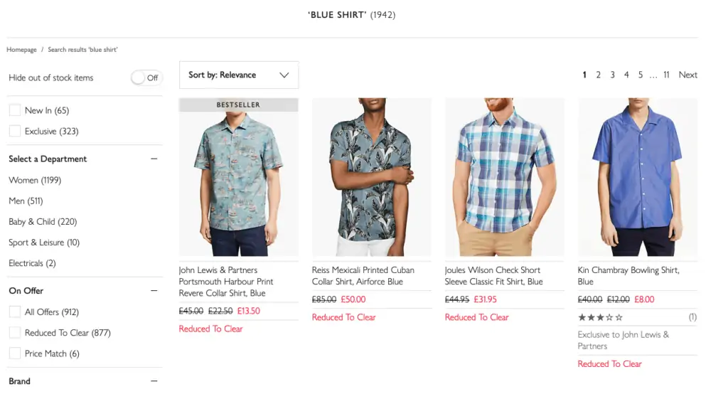
This is too much choice for many shoppers, and a lot of work to scroll through and consider each option. The answer is to provide plenty of filters for shoppers to use.
Here, John Lewis allows shoppers to filter their search by providing 14 different product facets to choose from – brand, price, pattern type, review rating and so on.
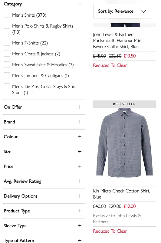
Using these filters, shoppers can reduce the initial sleetion of hundreds or thousands of products to a more manageable number, so they end up with a choice which matches their preferences on price and other product characteristics.
The challenge here is to make filters easy to use – being able to add and remove quickly for example – otherwise the filters represent another range of choices to add to the shopper’s work.
Help shoppers with decision making
Sometimes the problem for shoppers can be that they can’t distinguish between products, they can’t see why one is better or more suitable for them than another.
Comparison tables and tools
Comparison tables and tools essentially show the features and benefits of products together, sonthat shoppers can see which is the most suitable for them.
For example, this comparison table shows three similarly priced mobile phones together, so customers can decide which best suits their needs.

They can view battery life, storage space, reviews and key features side by side. This is much easier than viewing each product page in turn, and allows shoppers to weigh up the pros and cons and make an informed decision.
Product recommendations
Another way to help customers and reduce the choice paradox is to highlight particular products, as AO.com does here.
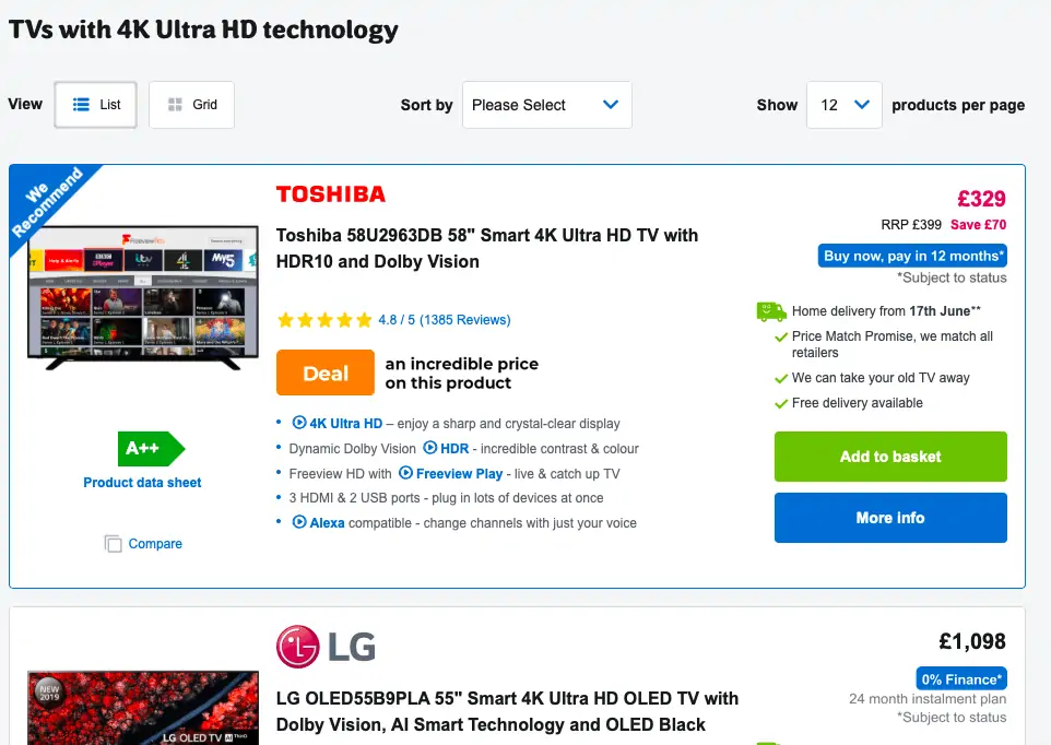
If these recommendations are reliable, perhaps based on reviews, satisfaction with these products, or other data, this provides a useful option for shoppers and simplifies their purchase decision.
Customer service help
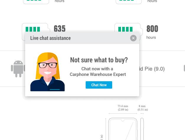
If customers are having trouble deciding on a purchase, then help from customer service agents, or from other forms of contact, is a useful option for shoppers.
It’s a good idea to make help options easy to find where customers are considering purchases, such as product detail pages, as in this example from Carphone Warehouse, when customers are comparing different products.
Use of data and personalisation
The more relevant the products that customers see on your site, or in marketing emails for example, the easier it is for shoppers to decide.
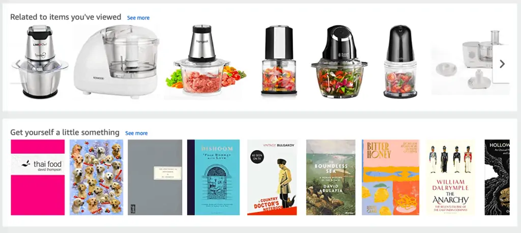
For example, Amazon will use my browsing and previous purchase behavior to show items it thinks are relevant to my tastes.
Customer reviews
Reviews from previous buyers can remove indecision by providing reassurance about product quality, and answering key concerns customers have ahead of purchase.
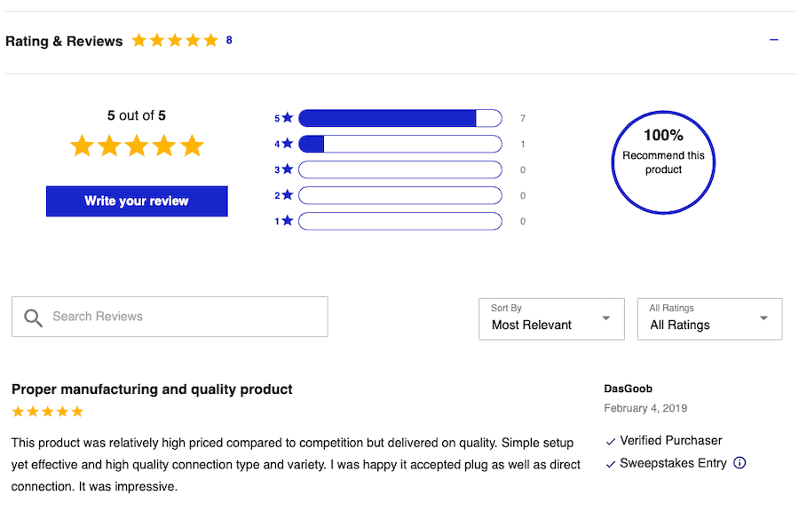
It can help them to decide which of the products they’re considering are most suitable. They may choose by the overall review score, or by diving into the detail of reviews.
In summary
Too much choice is only a bad thing if you make it too difficult for users to decide. Through tools to narrow customer choice, key information to help them decide, and by providing help where needed, any problem of choice paralysis can be minimised.
The key here is to help shoppers to come to an informed decision about their purchases. If they do, they’re more likely to have chosen a suitable product, and less likely to need to return it later.
