Form usability can make or break the experience for online shoppers. For any ecommerce site, they’re important for customers to sigh up for emails, register an account, or complete a purchase.
Well designed forms make these tasks as easy as possible for shoppers but tricky forms will infuriate them to the point where purchases are abandoned.
In this article we’ll look at some tips and key considerations for ecommerce sites to improve forms and remove friction for shoppers.
Users need to begin with the motivation to complete forms – this may be excitement about the product they’re about to buy for example.
This motivation can be drained from users quickly if forms become a hassle. If the amount of effort required is too much, this momentum can be lost.
1. Consider which form fields are really necessary
Stats from Baymard show that 21% of shoppers have abandoned ecommerce checkout forms because the process was too long or complicated. Baymard also found that the average checkout has twice the necessary number of form fields.
The bottom line is that forms shouldn’t be any longer than they need to be, so if form fields can be avoided or forms shortened, then this can reduce drop out at this stage.
For example, forms sometimes ask for a customer’s date of birth, which isn’t needed to complete purchases in most cases.
One way to approach this is to use the ‘question protocol’ which essentially considers why form fields are needed, the cost of asking /not asking certain questions, and ultimately whether each additional form field is really necessary.
2. Chunk up forms to improve completion rates
Forms can be as much about perceptions anything else. They can seem like hard work depending on their look, feel, and structure.
If a form has lots of fields to complete, and these are presented on one long page which you need to scroll down, this can be off-putting.
It can sometimes help to break forms up into sections so the task can be completed in easy bitesize chunks.
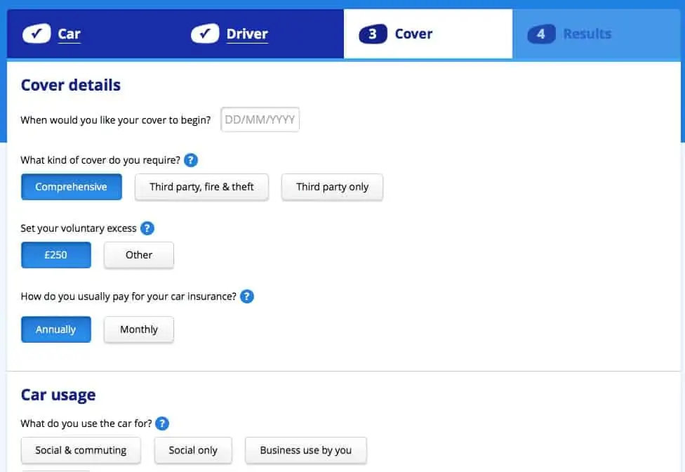
For example, confused.com splits its car insurance application into four sections. The same principle can work for checkout forms though, as always, it’s one to test.
3. Make forms visually appealing
Forms can contain the same number of fields, but still look like hard work compared to others.
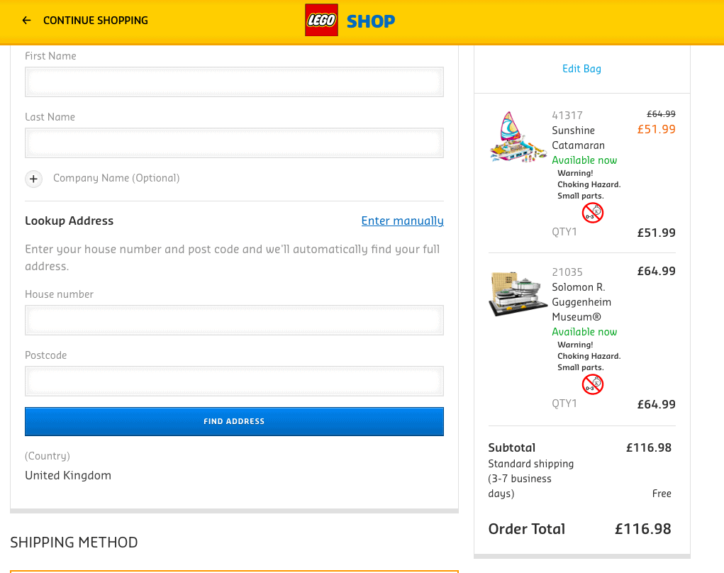
Dull text input boxes can make forms seem harder to complete, and make forms less enjoyable to complete. Clear design, use of colour and images like this Lego form make it more palatable.
4. Focus of mobile forms
According to Monetate, mobile conversion rates are 1.82% compared with 2.57% on desktop.
This is partly due to the relative difficulty of completing forms and entering payment details on a smaller screen.
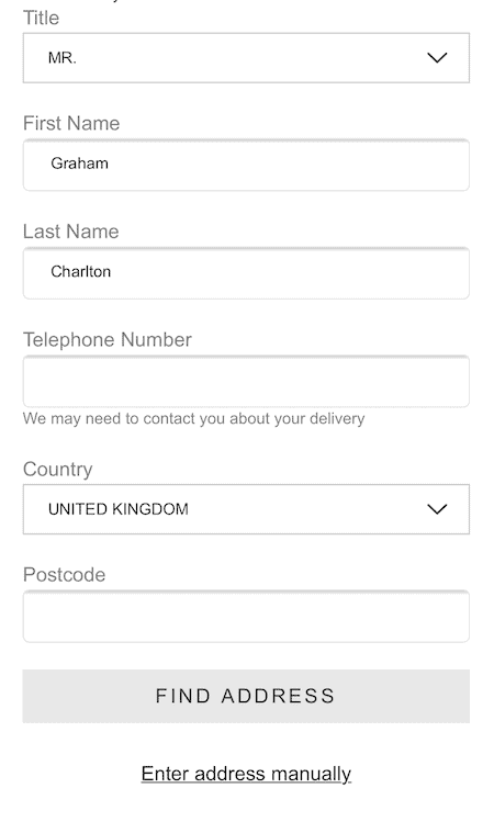
A focus on designing forms for mobile users can improve this. For example, making form entry fields big enough, and with space between them can avoid common input errors.
5. Make forms easier using smartphone features
The solution to some mobile checkout problems can be solved by using the smartphone’s potential to improve usability.
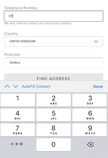
For example, defaulting to a numeric keyboard for entering phone numbers or payment card details speeds up the process.
6. Use in-line validation
In-line validation is a great way to reassure shoppers that they’re completing form correctly as they go along.
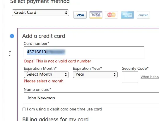
This helps, as any input errors are highlighted at the point they are made, meaning customers have the chance to quickly rectify any issues, and avoiding them submitting forms only to then see errors.
7. Error messages should be clear
People will naturally make errors when completing forms, so it’s important to handle them well. easy for them to correct any errors and move on through the form.
Error messages should be polite and informative, alerting customers to the error and providing clear information to help them fix it.
8. Add shortcuts
Anything that reduces user effort can help increase form completion rates. One obvious example is using the delivery address as the billing address, if applicable.
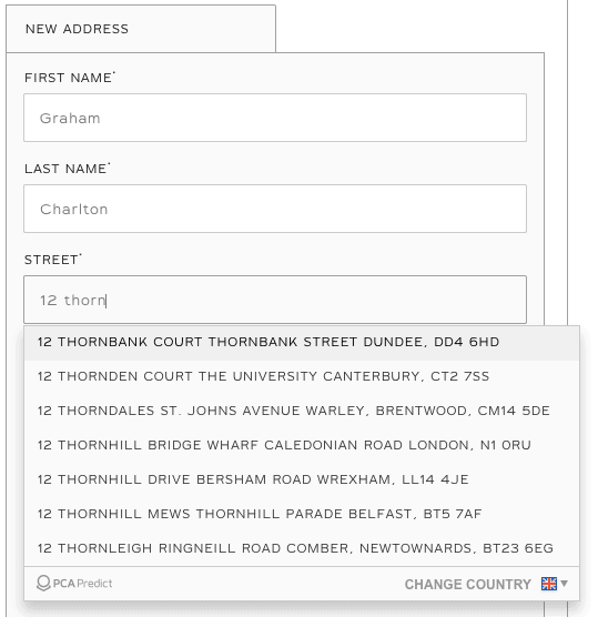
Others shortcuts can speed up address entry, searching based on postcode for example, or using software to suggest addresses and users type them in.
9. Add a progress bar
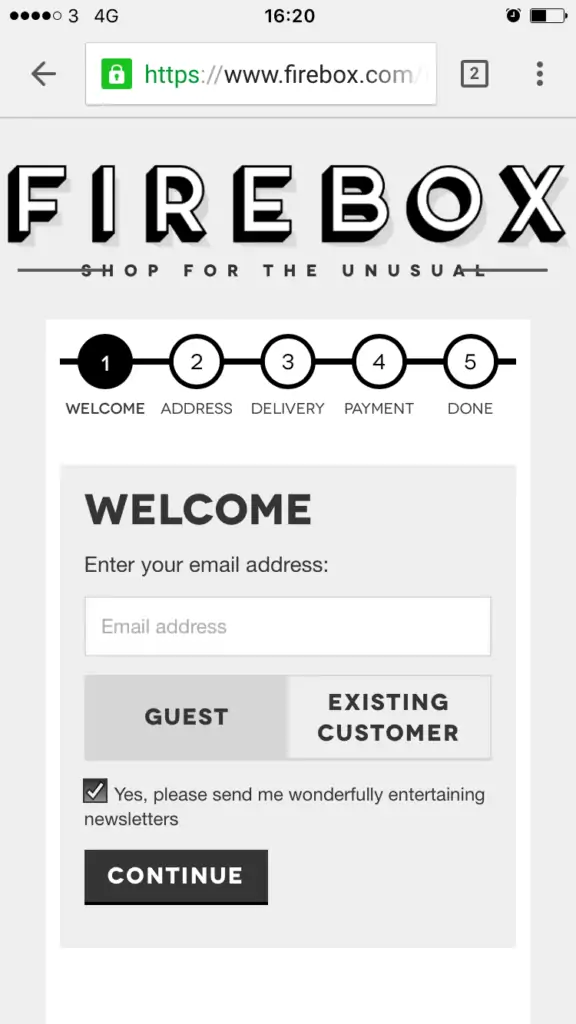
Checkout progress indicators tell people where they are in form-filling process and how many stages are left before they’re done.
They help to make forms seem easier, and reassure users that they’re almost done.
10. Indicate next steps with clear calls to action
Clear CTAs should indicate the next step that users need to take to get to the next step in a payment form.
They should stand out from the page and leave customers in no doubt about what they need to do to move to the next stage.
11. Reassure customers about security
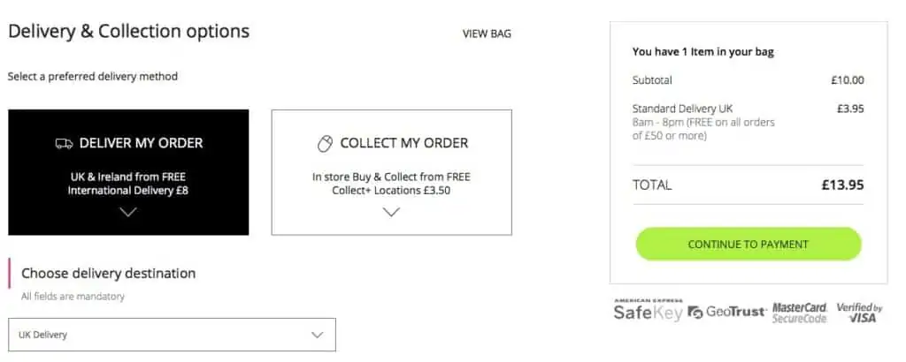
While completing checkout forms, customers can sometimes have concerns about payment security, and the general reliability of the site. This can be especially important if they’re buying from a site they haven’t shopped with before.
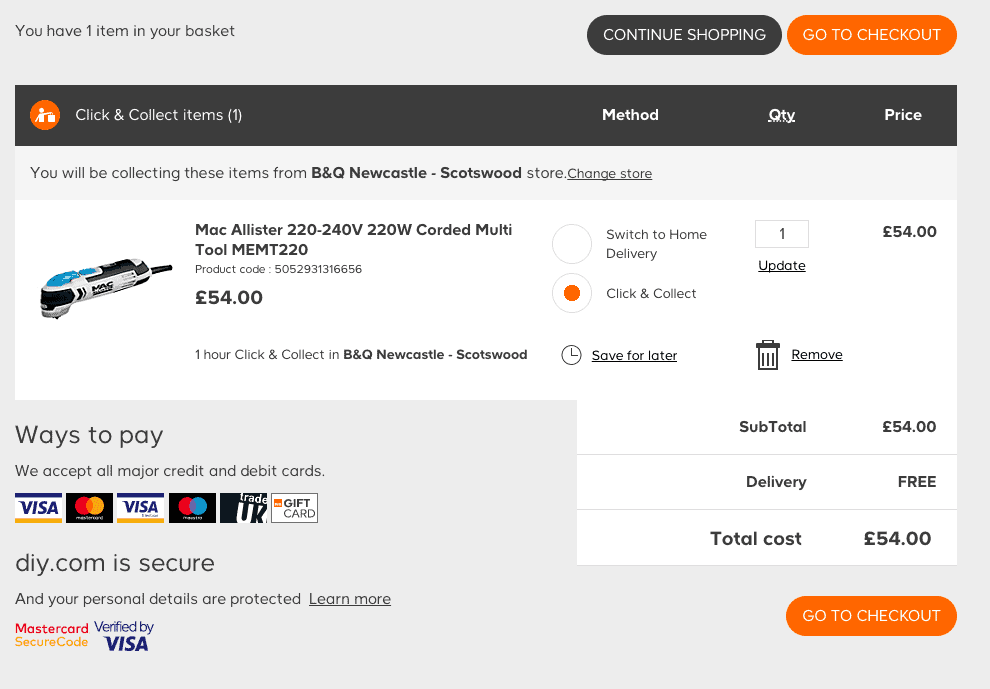
Showing trustmarks and messaging, as B&Q does here, can reassure some shoppers that the site can be trusted.
12. Allow people to get help during checkout
If people become stuck while completing forms, or have concerns about their purchase, it’s best to provide help there and then where the problem can be solved.
Displaying a clear contact number, a link to FAQs, or a live chat option all allow shoppers to access customer service help quickly.
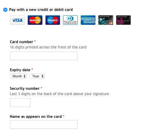
13. Use text to explain form fields
Many fields will be self-explanatory, but others may be less clear, so it pays to help customers at this stage
Well-placed copy can help here, explaining what information customers need to enter, and the format it should be added.
14. Remove distractions
Customers should be able to concentrate on completing forms. For this reason, websites often remove navigation menus and other features on forms.
This is known as enclosing the checkout, but the same reasoning can apply to many different form types.
It removes background noise, and makes the form fields, CTAs and key links easier to find.
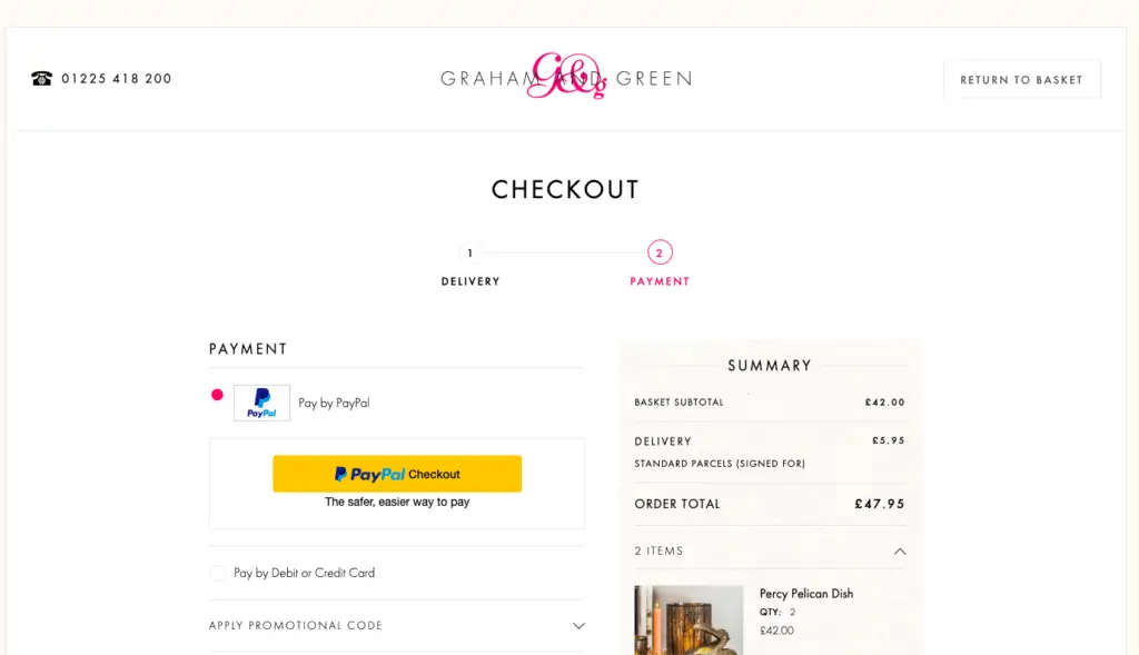
For example, Graham & Green’s forms are stripped back, with only the form itself and a contact number visible to shoppers.
15. Test and improve forms
It’s important to monitor performance to spot areas where customers may be dropping out of forms, or where certain fields may be causing problems.
Ecommerce consultant Dan Barker commented “tracking errors on forms, and field completion rates can both be useful for testing and improving. If you can spot that a particular error coincides with lots of drop offs, that’s a simple way to figure out what you should be testing next. Changing the order of elements on a form can help too – both in terms of helping customers get through a form, and occasionally for wider uses: For example, if your form has ’email address’ as the very last field and people drop off prior to that, you have no way of getting back in touch with them. If email is the first field, or even a separate first step (and assuming it fits with your privacy policy & terms) you can contact them, or at least recognise them, even if they don’t complete the form.”
Analytics, user tests and customer feedback can all help you to more identify problems with forms, and checkout more generally.
