
Adding items to a shopping bag (or cart) in ecommerce seems a simple enough process but it does present the retailer with a few choices.
This step can be used to move the customer closer to checkout and the completion of a purchase, but it’s also an opportunity to encourage them to add more items before they reach checkout.
In this article, prompted by Dan Barker on Twitter, we’ll look at some different approaches to this step.
There are four basic patterns most ecommerce sites use when a customer add an item to their shopping bag’:
- Take the user into a separate page / flow to sell other items.
- Use a ‘mini bag’, keeping the customer on the page with the bag link on the top right of the page.
- Use an overlay in which the customer can choose to head to checkout or continue shopping.
- Take the user straight to checkout.
Whatever the pattern retailers choose, it’s important that the customer has clear feedback that they have successfully added an item to their shopping bag.
The next steps should also be clear, whether the user wants to go straight into checkout, or continue shopping.
Each add to bag pattern has its pros and cons, so let’s look at each in detail, with examples from retailers.
Separate page and flow
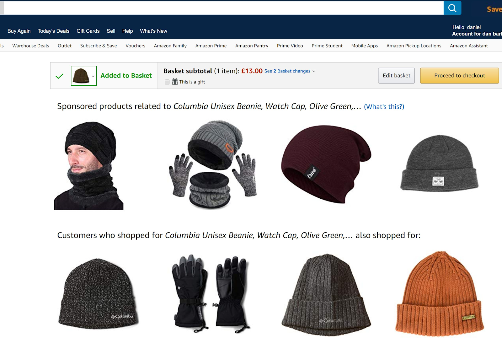
In this example, Amazon sends users that add items to a separate page entirely, but not straight to basket or checkout.
This allows Amazon to move the shopper towards checkout, with a clear call to action, but allows a lot of related product recommendations.
At this stage prompting cross-sells can mean more revenue for retailers, so it can be about the balance between promoting other products and potentially interrupting the route to checkout.
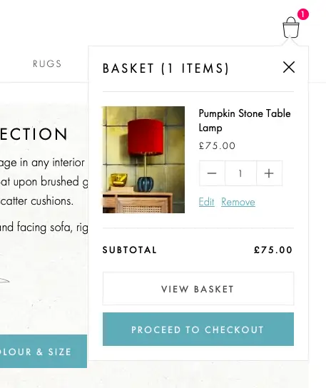
Using a ‘mini bag’
A ‘mini bag’ appears when shoppers add an item to their bag, often for a short time.
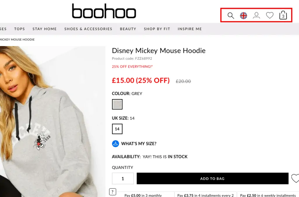
In this example from Boohoo, the mini bag is shown straight away, but disappears when the shopper moves the cursor away from the bag.
This gives the shopper the option to head for checkout or to view the bag, or just to continue shopping if they prefer.
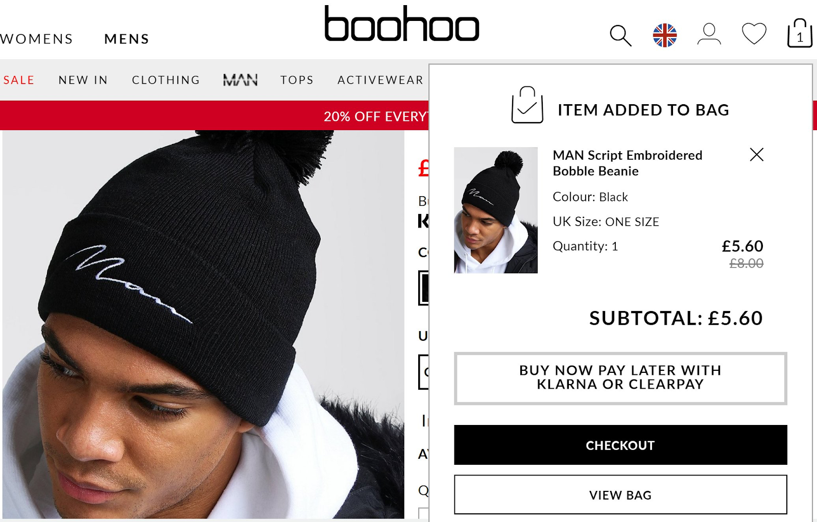
Boohoo opts not to cross-sell too heavily at this stage (there are some related products on the shopping cart page), though it does push users to continue shopping by making this the default option when the bag vanishes.
Overlays with choice of options
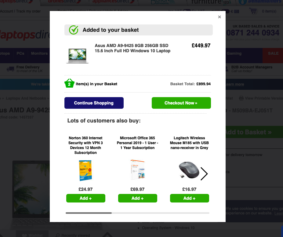
Using an overlay like the one below from Laptops Direct means shoppers have to make a choice at this stage, between heading to checkout or continuing to shop.
It also presents an opportunity to offer cross-selling options. For retailers like this, the main buy, in this case a laptop, may be relatively low margin, so it pays to promote add ons like accessories and extra software.
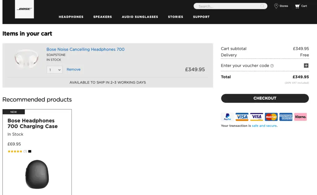
Take the user straight to checkout
This option takes customers to checkout more quickly, and avoids distractions which may deter people from completing checkout.
There’s still an option to promote cross sells on the shopping bag / cart page, but this approach is more focused on the immediate conversion.
Providing clear feedback to shoppers
It’s important to confirm to customers that they have successfully added an item to their bag.
The four patterns shown above all achieve this, though some sites use other methods.
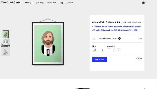
This, from the Cool Club is a fun effect which catches the eye and clearly confirms that items have been added to the cart:
Reminding shoppers of shopping bag contents
If shoppers choose to keep shopping rather than heading to checkout, or even if they leave the site and return later, it’s important to remind them that they have items in their basket.
Some are very subtle, as in this example from Boohoo. The number has changed and this will be seen by shoppers who look top right for the bag/checkout link.
Others sites add more of a highlight, using coloured numbers to catch the eye and remind users of the basket contents.
It’s also useful to show the bag contents on hover, which is a quick and easy way for shoppers to check.
In summary
There are pros and cons in the different approaches shown here. One key element is that shoppers should have clear feedback that items have been added to the bag, and that – for those who are ready to checkout – the option to do so feels like the ‘next logical click’.
The choice of approach may depend on the relative weight given to customer acquisition or overall revenue. It can also be about the product range – how well it is suited to cross-selling or the margin on products. Low margin retailers may need to encourage cross-selling more than others to maximise revenue.
So, adding more cross-sell options or promoting them more ‘aggressively’ may lose some sales but can increase the average order value and overall profit.