Product page copy is there to inform, persuade, and even entertain shoppers, all with the aim of nudging them towards making a purchase.
The kinds of copy used on ecommerce sites will vary according to the brand, products and target customer.
Here, we look at some varied examples of ecommerce product copy from ecommerce sites.
1. Lush
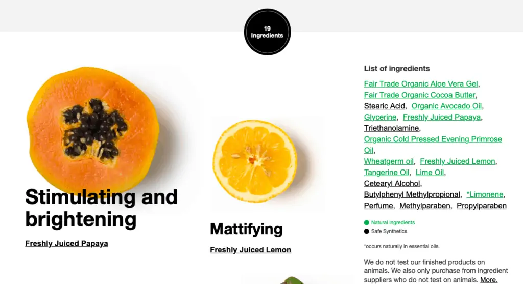
Lush is built around ethical products which do no harm to animals, and its product copy reflects this mission.
In contrast with many cosmetics retailers, Lush is very transparent about the ingredients of its products, listing them all clearly and prominently on the product page.
This helps address customer concerns about ingredients and also uses the natural ingredients used in its products as a USP.
2. J Peterman Company
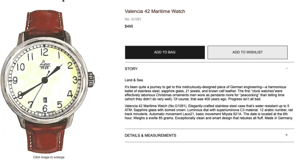
The J Peterman Company has unique, entertaining copy which tells a story around its products, while still emphasising the quality and provenance of items like this watch.
3. Bellroy
Bellroy’s product pages work hard to describe and sell its products, and are especially notable for the use of imagery.
The copy is excellent too. I like the efficient use of space below the CTA to highlight key
selling points.
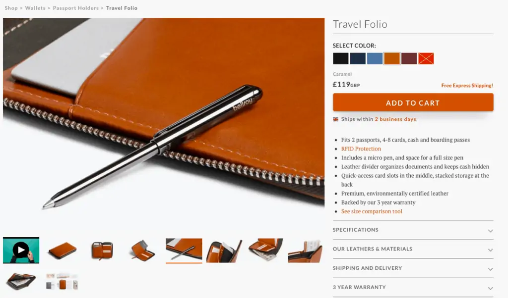
Copy doesn’t have to be lengthy. It cane enough to highlight key features prominently and place more detailed copy under expandable menus or further down the page.
4. Forever 21
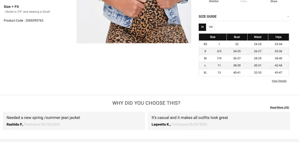
I’ve picked this one out because, as well as the copy being very good, it uses reviews in a very clever way.
It asks the simple question, ‘why did you choose this?’ and shows answers from previous customers. It’s great social proof, and a great way to make use of customer reviews.
5. AO.com
For some products, shoppers need plenty of detail. Laptops and PCs are one such example, where sites have to show a lot of detail.
While some laptop shoppers will view battery life as the key feature, others want the fastest possible processor, or a smaller screen, and so on.
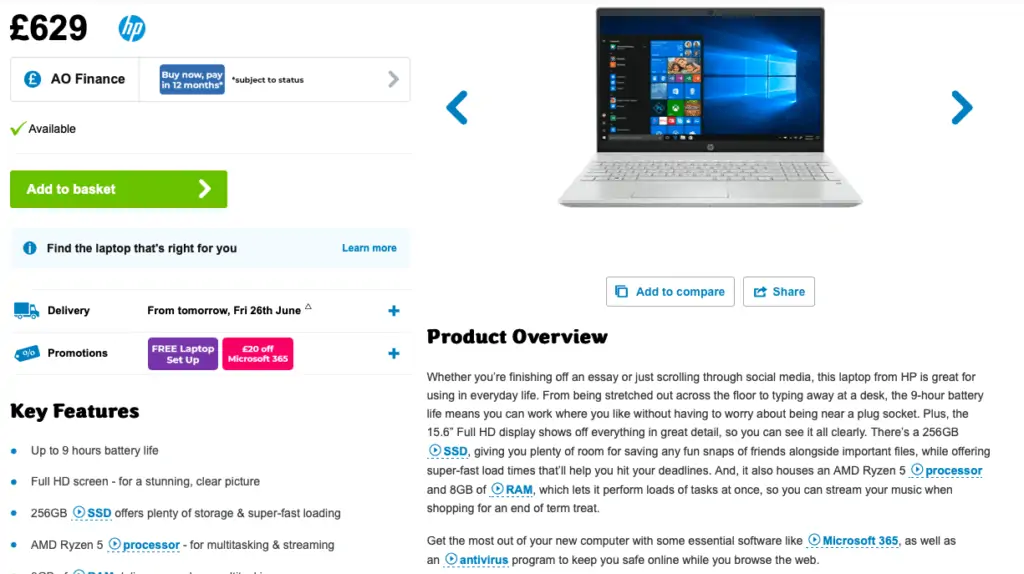
It’s about presenting this information so people can quickly find the detail that’s relevant to them.
AO.com is a good example of this, prioritising key features on the left of the page before going into more detail with a product overview and specifications.
Good formatting and presentation of lots of text means that shoppers can easily pick out the parts that are relevant to them.
6. Loaf
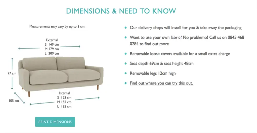
This is a good use of an informal tone of voice to convey information about the dimensions of sofa and little details like installation and removal of packaging.
7. Firebox
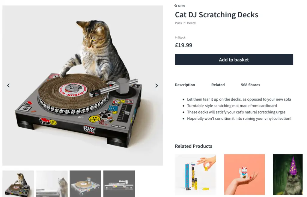
Firebox product page copy is nice and succinct, summarising key points of products, or just having fun.
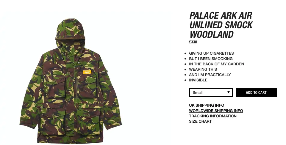
8. Palace Skateboards
Copy that tells you very little about the products, but that isn’t the point. Palace sells without having to try, and its fun just to read the product pages.
Use of iconography to quickly showcase important product features
9. REI
This copy is all about understanding what customers want, and picking out the key details shoppers are looking for.
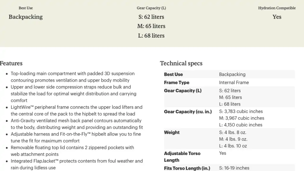
It picks out the best uses for the products, and makes it very easy to scan both technical detail on size and capacity and to pick out key selling points.
