What are the most important pages on your website? Which should you pay the most attention to?
In this guide, we’ll look at these pages in detail, explaining why they’re important, and how you can make the best use of them.
In the following order, these are the six most important pages on most ecommerce sites:
- Product detail pages.
- Product listing pages.
- The homepage.
- Shopping cart or basket pages.
- Checkout.
- Thank you pages.
68. UX.
— dan barker (@danbarker) February 9, 2020
The most important pages on an ecommerce site are usually (in order):
1. product detail page.
2. product listing page.
3. homepage.
4. bag page/step.
5. checkout.
6. thank you page. <– this is a forgotten page, but can be used very well.
Product detail pages
Product pages are where shoppers make the key decision whether to buy a product from you or not, based on the information and images they see on the page.
A shopper may arrive on the product pages from several different routes. They may, for example, have started on the homepage, viewed other products and filtered by different product attributes before arriving at the page. They may have clicked on a link from a promotional email, searched directly from the homepage, or arrived via a search engine.
The product page has to deal with all visitor types. For example, visitors from Google may arrive with no previous knowledge of the site, so the product details page has to sell not only the product but the ecommerce site as well.
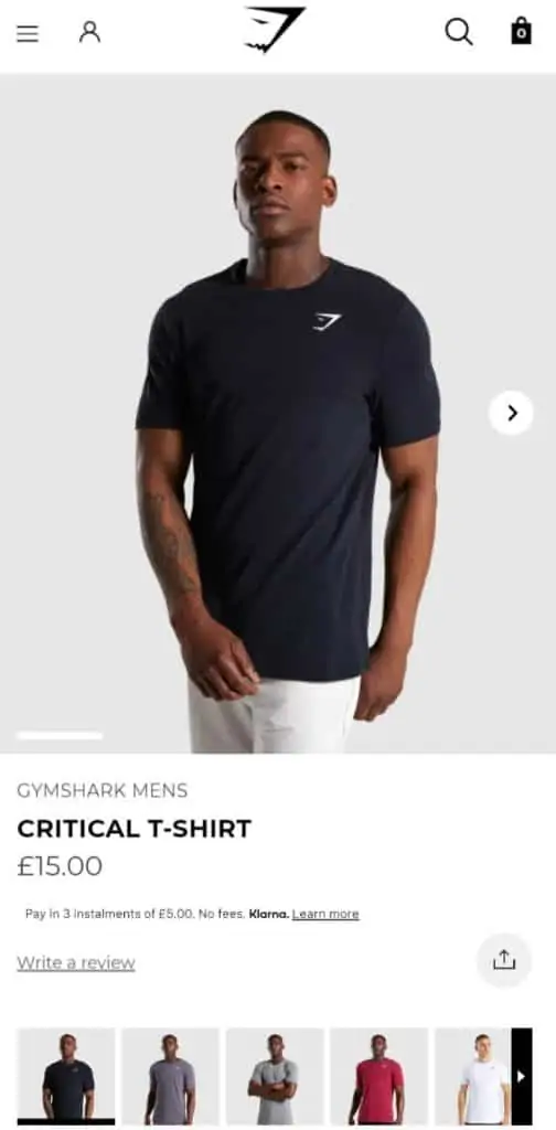
These are some key features and information to present, which will vary between retailers. A fashion site, for example, will focus more effort on image and video than product information.
- Product images and video. Images can show products in attractive lights (fashion, jewellery etc) or help to convey key information quickly (the number of ports on a laptop for example).
- Product information. It’s good to convey key points about products – size, material, technical detail etc. Many sites choose to highlight key selling points prominently with more detailed information presented further down the page.
- Price. It’s also good to highlight any discounts or related offers.
- Delivery and returns information. This can be key to the customer’s decision and should be visible or easily accessible from the product page.
Product listing pages
Product listing pages are those category, subcategory, product type or site search results pages which show when shoppers navigate using links or search for a product or category from the homepage. Some may also show in search results.
These pages are there to help customers shopping for a type of product, and perhaps one matching a set of criteria they have already entered.
For example, visitors looking for laptops may have selected a brand and price range to narrow their search, and the product listings pages help them to decide which ones may be worth a closer look.
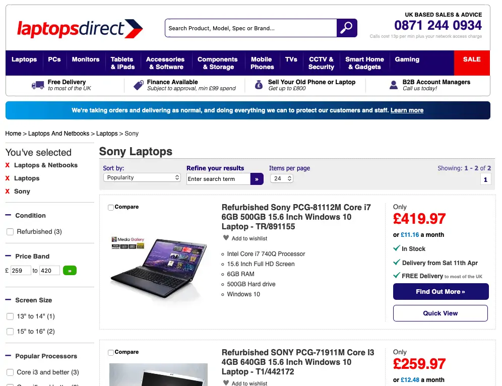
In the example above, the listings page is there to help the customer narrow their choice and find the product that best matches their requirements.
The page needs to present products so that shoppers can see key information at a glance that helps them to decide, and in many cases to provide the tools they may need to help them to narrow their decision further.
In the example above, shoppers can add more filters to narrow down and make their product selection more relevant, or remove some if they see fewer results and want to check different brands, features or price ranges.
Fiters like this can work well for retailers with larger product ranges, as well as products such as laptops with a variety of specifications to consider. It’s important to keep fileting relatively simple though, so it doesn’t become a distraction or even obstacle to the purchase.
The product details presented on such pages become a mini product page, presenting the key information that retailers think is most crucial to the customer’s decision to purchase.
There are different approaches too. For electronics sites presenting the key selling points of technology matter more than images, while fashion retailers will give more prominence to visuals.
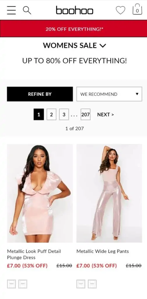
On these mini product pages, retailers will often highlight key drivers of sales, such as free or fast delivery and active discounts.
The homepage
Direct purchase decisions aren’t made on the homepage but it’s still important. This is because a large amount of traffic still enters the site through this page, while it can also be a point where shoppers reorientate, perhaps clicking back to the homepage after viewing other pages.
In this context, the homepage allows you to signpost users to what they want to find on the site, through site search and navigation as well as featured products or categories.
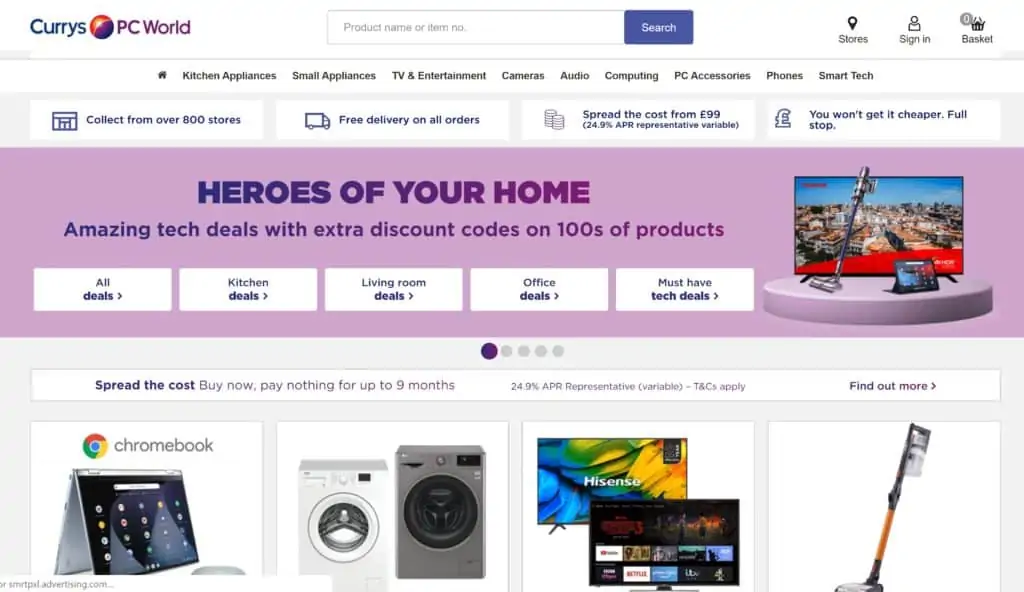
It also allows retailers to highlight products or categories that you think they may be interested in, but are not actively looking for. So products can be shown to shoppers or existing customers based on previous browse or purchase behaviour for example.
The homepage also acts as an introduction, or reintroduction to the retailer. It allows a brand to tell new visitors what they’re about, what products are on offer, and get across key USPs. For example, a brand may choose to use the homepage to underline its mission statement,perhaps a commitment to environmentally friendly products for example.
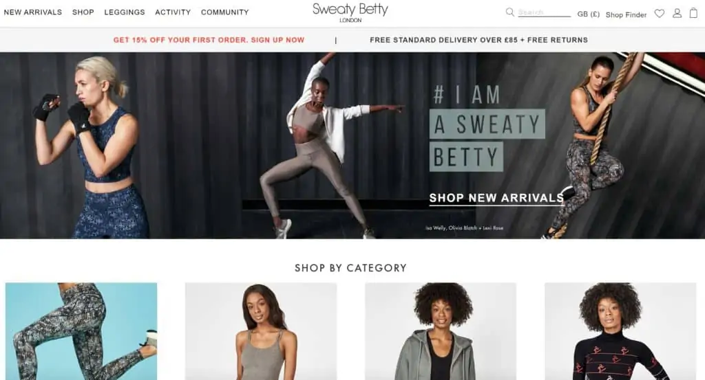
Shopping cart pages
By adding items to their carts, shoppers have indicated a clear intent to purchase, and this page represents the bridge between the product page and checkout.
For retailers, the page is about moving shoppers into the purchase process but it’s also an opportunity to sell them other items while they’re there, using cross-selling suggestions. The balance between the two goals is important, and the approach will vary between retailers.
It also represents a chance for shoppers to review the contents of their basket and make any edits. The shopper may head to the basket step straight from the product page in many cases, but they may be returning after leaving the site for some time, or perhaps having been tempted back by a cart recovery email.
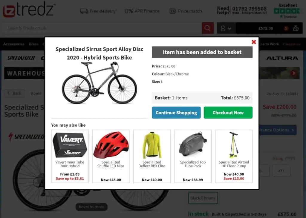
Many retailers choose to make this more of a step then a page or to keep this page as uncomplicated as possible, to remove any unnecessary friction for shoppers.
Checkout
Once they reach checkout, the customer has taken the time and effort to pick a product and has come to the point of purchase. From a retailer’s perspective, a lot can still go ‘wrong’ at this point. An average of 70% to 80% of shopping carts are abandoned.
Baymard stats point out some of the common reasons given for abandonment during checkout:
Ideally returns policies, delivery timings and total cost should be clear before customers reach checkout, having already been communicated via product pages, though the need for customers to enter ZIP codes for accurate shipping and tax does present a problem for some US retailers.
A lot of other reasons can be addressed by design choices.There are no right or wrong answers, it’s about what works best for retailers in terms of completed transactions and order values.
Broadly speaking, a checkout process which keeps friction to a minimum and allows customers to complete purchases easily will help to convert more shoppers. However, there is a balance to be struck, as a little extra friction, perhaps through cross-selling, can help to increase order values.
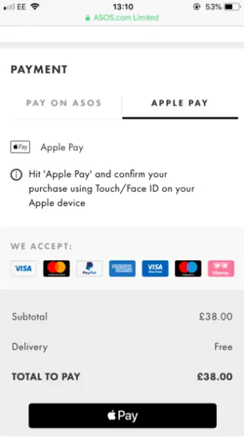
In other cases, it can be about choice. Customer preferences for payment methods change, so retailers need to keep an eye on trends and be prepared to offer greater choice. Some payment methods can help to reduce friction – it’s much easier to use Apple Pay or Google Pay on a mobile checkout for example.
Thank you pages
This is where customers receive a confirmation of their order, and hopefully a thanks for choosing to shop with a site. It can be an afterthought for some sites, but it’s important for several reasons.
First of all, it’s there to reassure customers that they’ve bought the right thing, so it’s a good idea to summarise the purchase, costs and key details like delivery timings.
It’s also a place where customers are open to be provided with extra information and options. You have the shopper’s attention so it can pay to make the most of this.
The ‘thank you’ page (aka receipt page) is often an afterthought for ecommerce sites. But it’s here where: a) customers are reassured they’ve bought the right thing. b) have made a purchase, and are open to be provided with any/all extra information or options from you.
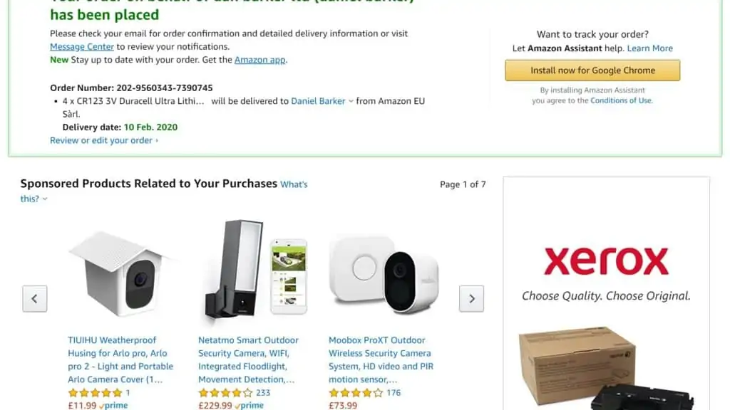
For example, you could ask the user to:
- Create an account to make future purchases easier.
- Install an app.
- Encourage them to leave a review.
- Ask for feedback about their on-site experience.
- Encourage social shares and referrals to friends and family.
- Provide tracking info.
- Show key product information such as size guides for fashion or links to general product help.
- Highlight related products to those the’ve purchased.
