
An ecommerce homepage won’t always be the first page visitors will arrive at on the site, as much traffic will go direct to product pages from search and other channels such as email.
However, it is still likely to be one of the most popular pages, and it’s one that plays a part in the user journey, whether they arrive at this point or click back after viewing other pages.
It has a number of tasks to perform, from directing users to the categories or products they’re interested in, highlighting key products, introducing the brand, or perhaps directing shoppers to help or contact information.
That’s a lot if potential uses and information to get across to visitors, so it can be useful to think about it in terms of the ‘inverted pyramid’.
The inverted pyramid is a term often applied to journalism. In this model, the widest part of the pyramid at the top represents the most interesting and important information the writer needs to convey early on (the hook), while the rest of the information needs to be shown in diminishing order of importance.
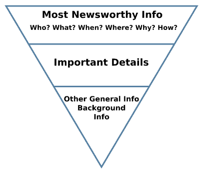
In the context of an ecommerce homepage, this means that the top portion of the screen should show the things that apply to most visitors, and those things the retailer wants to prioritise, as pointed out here by @danbarker in his thread of ecommerce tips:
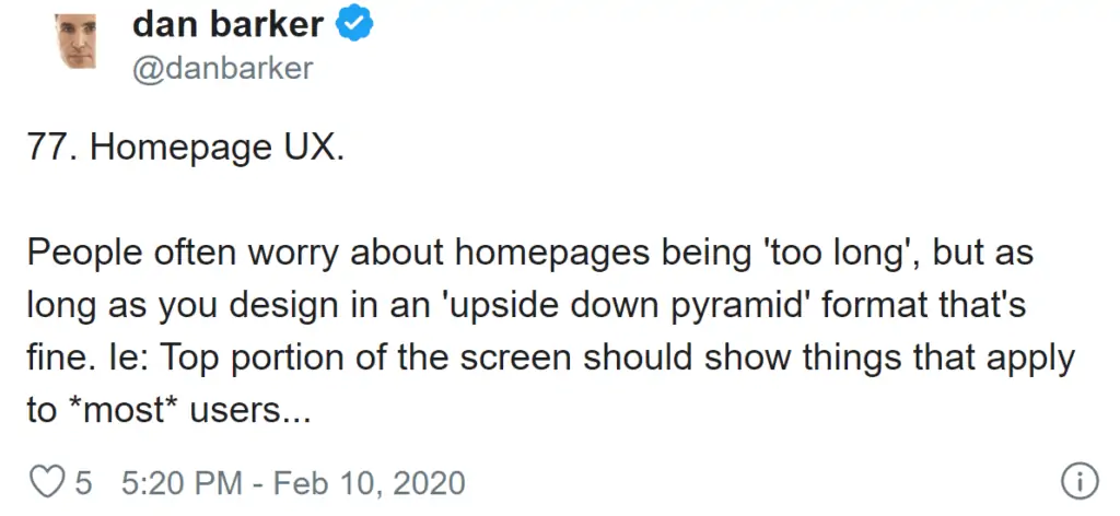
As a general rule, the further down a page an item is, the fewer visitors will see it. However, these users may be some of your keenest, most loyal visitors, so this needn’t be a problem.
This pyramid pattern applies to desktop and mobile, but can be more important on the latter, as the amount of page viewable above the fold will vary by screen size and device.
Some retailers think it’s better to avoid including category links on the homepage, as they’re available through navigation anyway. However, on mobile fewer visitors will see the whole navigation menu, and besides, more visibility means increased clicks.
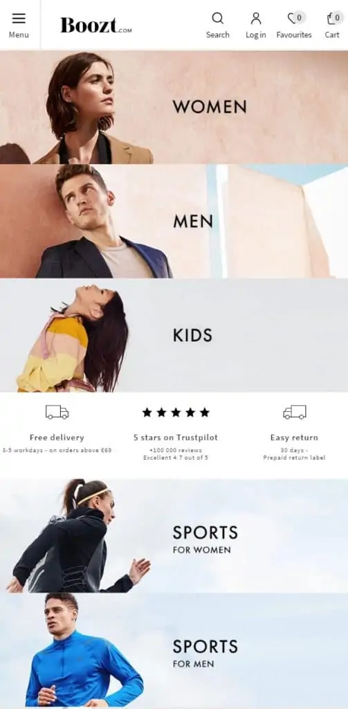
Here’s a nice example of the ‘inverted pyramid, and also of showing categories on a homepage, from Boozt.
The categories are organised in order that they’re likely to be clicked, with more niche ones further down the page.
This is the bottom of the same page. It reinforces what the visitor has seen with some good social proof to build trust, then provides a quick route back to the top of the page.
One pattern you’ll often see in mobile user tests is that visitors scroll down to the lot of mobile pages before scrolling right back up, or clicking menu. This ‘back to top’ link is there to help these users.
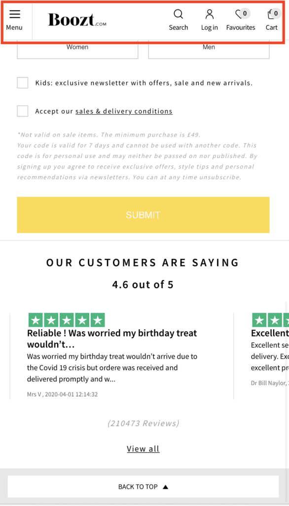
The top navigation menu, containing links to the menu, site search and cart is pinned so that it remains accessible for the user at any point.
By pinning the navigation, or making it visible as soon as a user starts to scroll back up means that the cart and other key links are always just one click away.
Sweaty Betty’s mobile homepage follows a similar pattern The menu is top, while the prominent space in the bar below highlights USPs and special offers, in this case a free delivery threshold and free returns.
New arrivals are next, which is something which regular visitors are likely to click on.
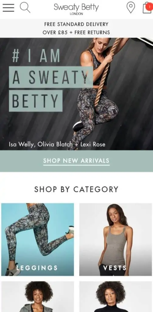
Then Sweaty Betty shows its evergreen best-selling categories – legging and vests, before showing seasonally appropriate categories, in this case jumpers and base layers.
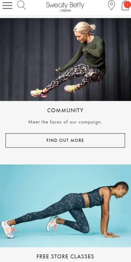
Then, at the foot of the page the site shows more niche content and items for the (more motivated) visitors who scroll further down. Note also that the top navigation bar is pinned and therefore always visible.
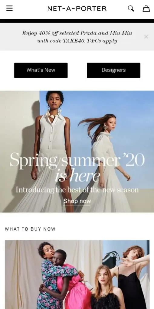
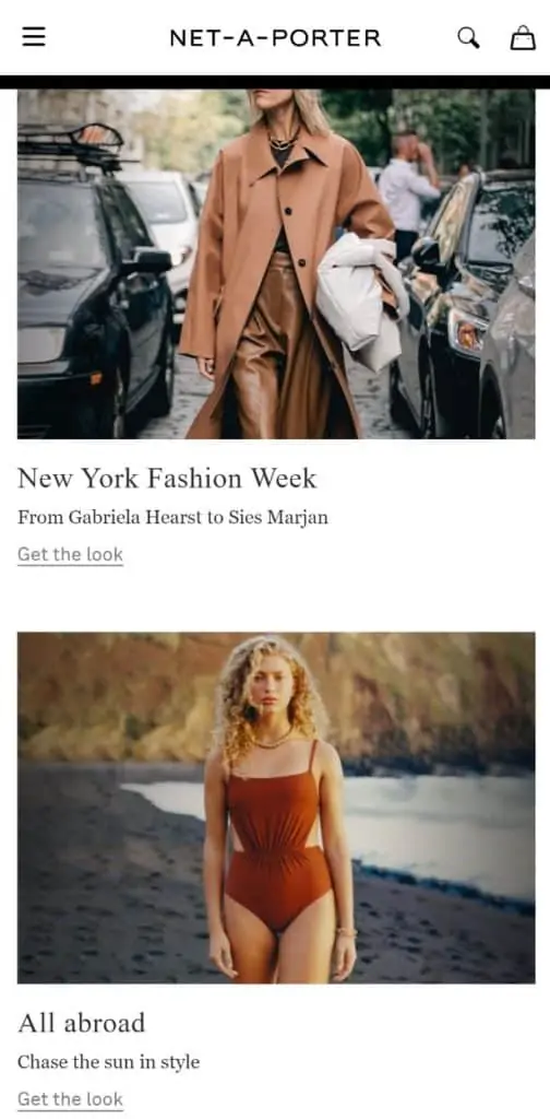
Net-a-Porter has another variation on the inverted pyramid pattern.
It starts with the menu and top navigation bar, which is again pinned to remain visible wherever the user is on the page.
After the USP / offer bar, the ‘what’s new’ and ‘designer’ links are in very basic blocks, indicating that these are the most likely clicks for visitors.
This is followed by more seasonal content, with the page becoming more niche. Net-a-Porter uses content very effectively and therefore finds a place for this where many sites wouldn’t.
This is followed by more seasonal content, with the page becoming more niche. Net-a-Porter uses content very effectively and therefore finds a place for this where many sites wouldn’t.
This pattern is repeated across many ecommerce sites, on both mobile and desktop It helps retailers to show as many products and as much content as they need to on the page, while catering for both the casual and more committed user.
The key here is for retailers to know how to prioritise products and content, and to learn from user behaviour and place items in the order that products the best results.