Site search in ecommerce has a very simple role, to help the visitor find what they’re looking for quickly and easily.
It’s an effective shortcut for shoppers who arrive on a site with an idea of the products they want to buy, and forms a useful alternative to browsing with the usual navigation options.
If site search performs poorly on an ecommerce site, it can have a direct impact on revenues, average order values, and a poorer experience for the shopper.
It’s important to consider the user experience and performance of site search, whether optimising site search or choosing a site search system.
In this post we’ll look at some examples of best practices in site search.
1. Site search box placement
The placement and size of the site search box on an ecommerce site can sometimes show how much a retailer wants visitors to use the function.
If you make the search box more prominent, more people will see it and consider using it.
This could be a design choice, to save space for other messaging or navigation options, or a reflection of necessity.
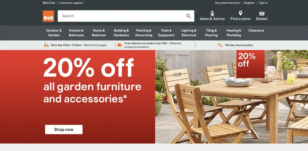
For example, Amazon and other sites with a large product range will often make the search box the most prominent navigational feature, as B&Q does here.
Others, and this is often the case for fashion sites, will make the site search box far more subtle, as Monsoon does.
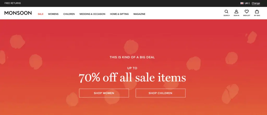
It’s a choice for retailers to make – make the search box highly visible and you’ll attract more site search users. If you make it more subtle then people will be pushed towards other navigational options.
2. Consider the size of search boxes
The size of the search box will partly affect usage, but it’s also important for the way people use it.

A larger site search box can make it easier for users to enter long search terms, such as laptops with long model numbers or specification. to enter longer product names – TVs with long model numbers for example. The text remains visible and shoppers can edit terms more easily.
3. Adapt the site search box for different types of sites
The standard search box is a plain text box waiting for shoppers to enter their chosen term.
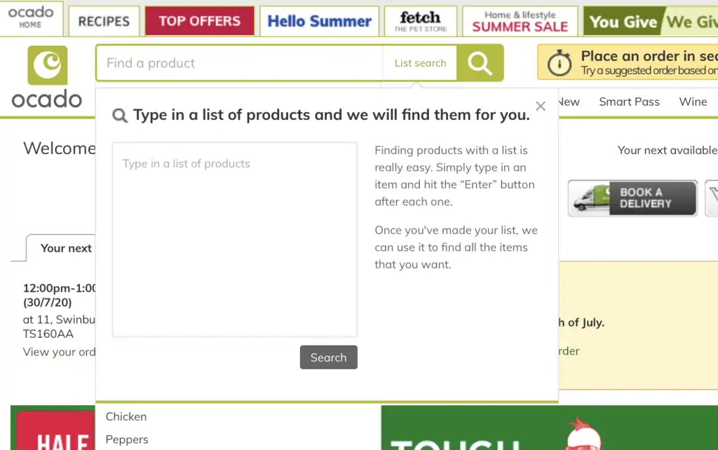
Some are adapted for different sites. For example, Ocado has a list search function which allows shoppers to input multiple items.
4. Use auto-complete to minimise errors
If shoppers make mistakes, this can produce unsatisfactory results, and are therefore less likely to convert.
Auto-complete helps to avoid customer errors and also speeds up the process by reducing customer effort.

5. Use image search where appropriate
For some sites, and this is especially useful for mobile sites and apps, it can pay to offer different types of search.
For example, ASOS has a visual search function for mobile users, so they can upload photos of items they’ve seen to find matches.

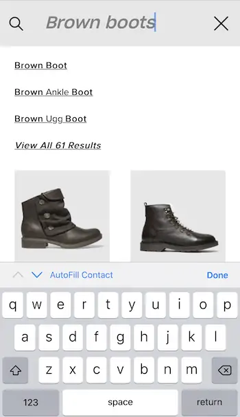
6. Show images as people search
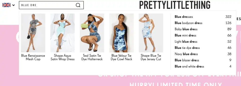
The use of images in search box auto-complete is another feature which help reduce errors . It can also work for merchandising, as it allows retailers to highlight key products they want to push.
It can also shorten the process of product selection if users see a product they like straight away.
7. Add text to search box
Text in search boxes can be useful to prompt customers to use site search, but can also show them how they can use it – to search by product numbers for example.

8. Make site search visible on every page
Users don’t necessarily enter sites through the homepage, so they should be able to find the search box wherever they land, our find themselves on your site.
9. Optimise for mobile search
With more and more retail traffic coming from mobile, its essential that site search works for these devices.
Auto-complete helps here, as it speeds up search and minimises error.
10. Show search results quickly
Site speed matters, and so do site search results. Search results can take a while on some types of website – travel sites for example – but it pays to optimise speed here as users can lose patience.
11. Ensure relevance and accuracy of results
If the results users see seem to be unrelated to their search, they’ll lose interest and trust in the site search function.
Accurate product labelling helps here, as the ability to adapt for how users search, and to account for synonyms.
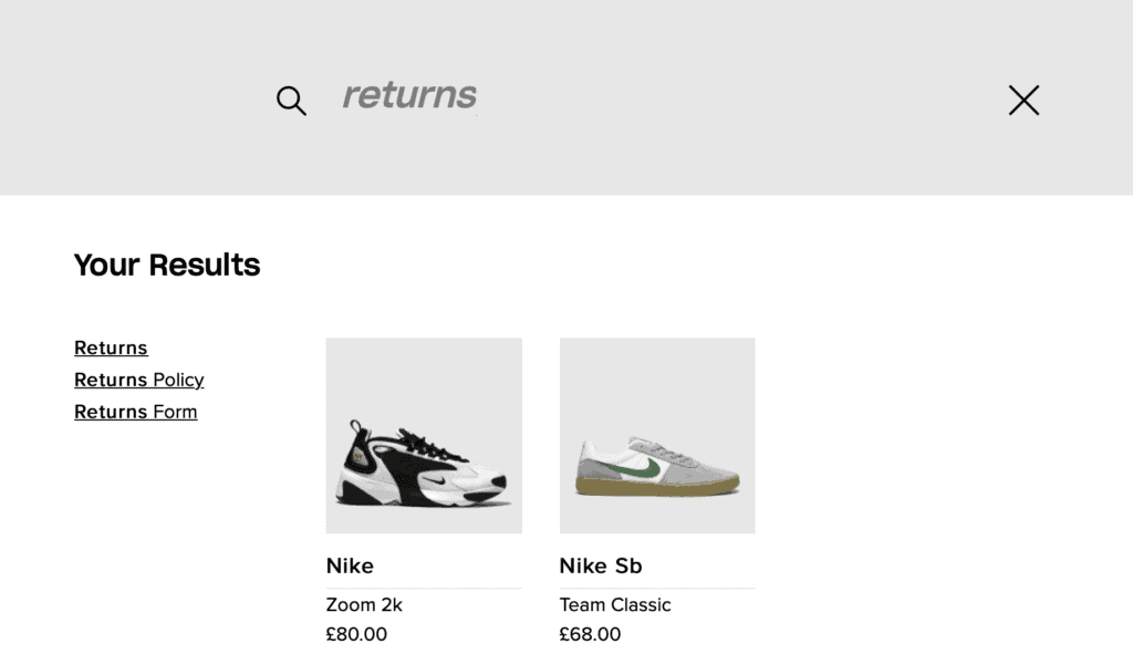
12. Return results for non-product searches
People will sometimes use site search to find general information, perhaps ecommerce returns policies or contact details.
13. Avoid dead ends
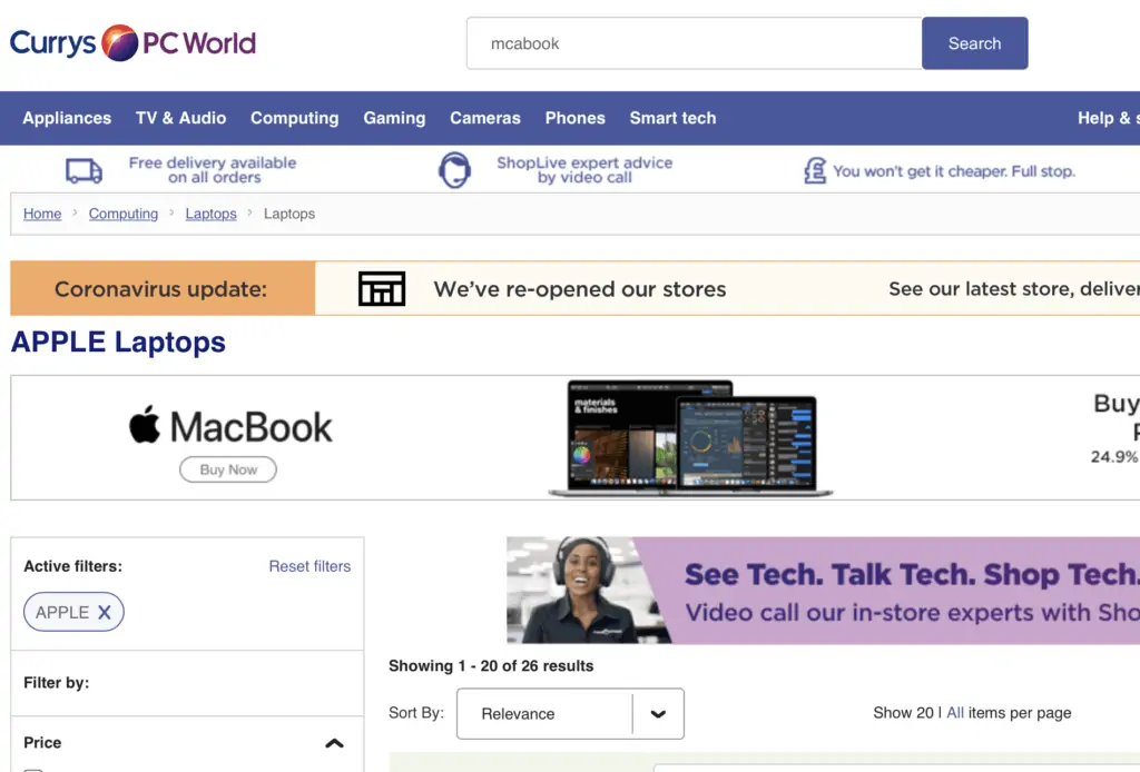
Returning no results at all is a dead end for shoppers. Retailer can avoid this by anticipating common spelling errors and typos, or by presenting a chance to search again or browse by sections.
14. Provide effective filtering on search results pages
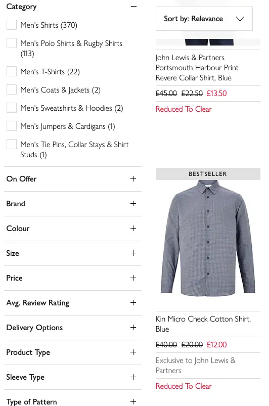
Some searches will return large numbers of results so it’s vital that shoppers can make sense of them, and narrow them done according to their preferences.
This can help avoid the ‘Paradox of Choice’, when’s users can struggle with too many options.
Filter options such as size, colour, department, price range and brand help searchers to narrow from lots of search results to a lower, more manageable number to choose from.
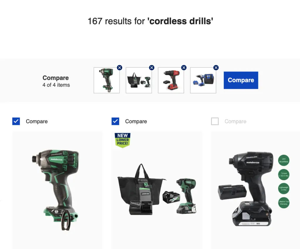
15. Allow for easy comparison between results
With lots of results to choose from, and often similar products, allowing customers to compare product features side by side aids their decision making.
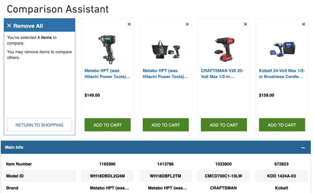
In this example, Lowes provides a check box to add up to four items from search results to compare.
These are then show side by side in a comparison table so shoppers can take a closer look. This makes it easier to compare than it would by viewing product detail pages one by one, and can help customers come to a decision more quickly.
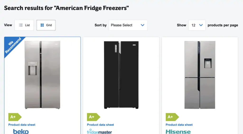
16. Provide different ways to view search results
Being able to edit the way search results are presented helps shoppers to choose the view that works for them, helping them to browse and select products more easily.
17. Show key selling points in product previews
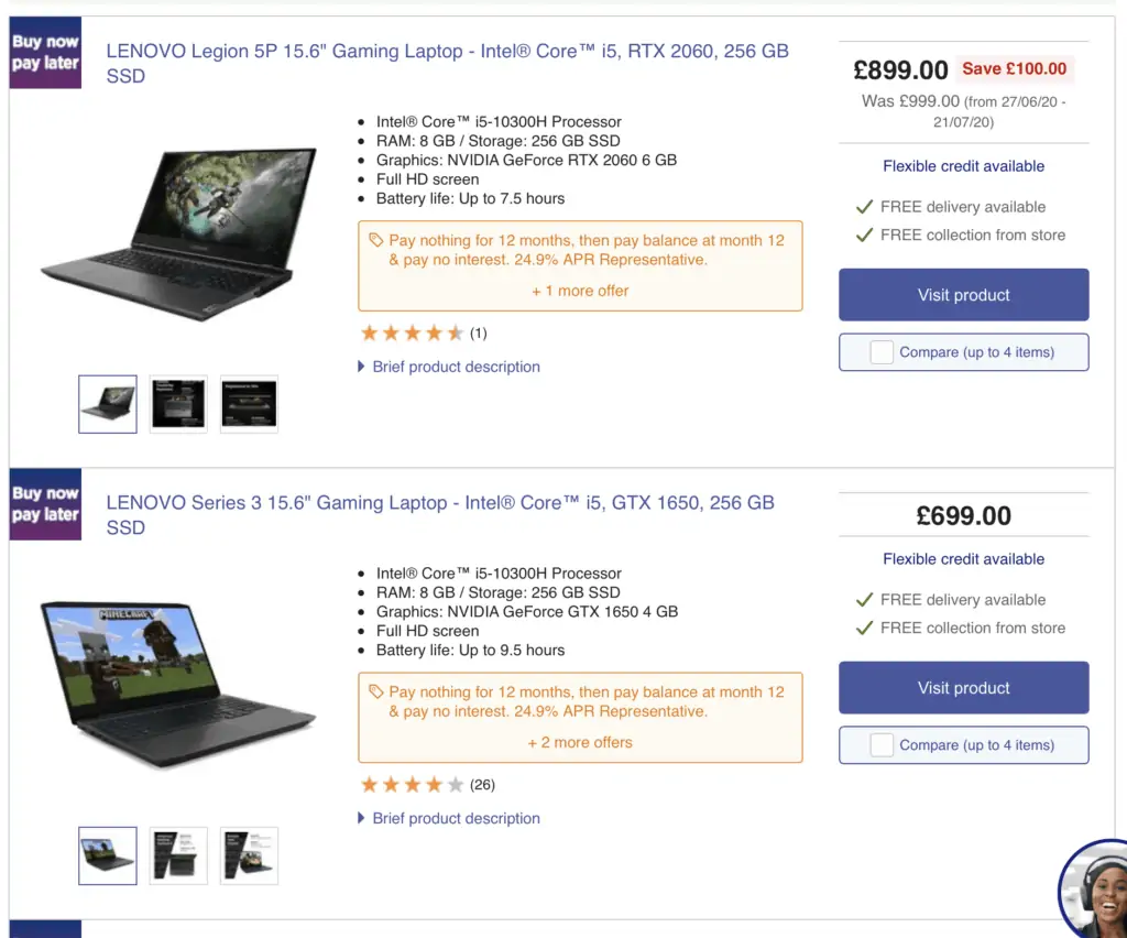
On site search results pages, people scan down the list to make a quick assessment of the products listed.
It can help here to list the key selling points of each product to help with decision making. Price is important, but key product USPs like battery life for electronics, or factors like free delivery or finance options can entice shoppers.
18. Use customers reviews to help shoppers filter and choose
Customer reviews help shoppers to make a quick assessment of products when viewing search results.
They can be shown in product previews, or used as an option to filter out results with good review scores.
19. Use site search data
It’s a great idea to look at the way that customer search for products on your site. For example, you can understand the language that shoppers use when they search.
This can help to improve your own research, but these insights can also be used elsewhere.
For example, the way customers search on Google is likely to be the same, so these insights can help to inform search marketing.
20. Use analytics to review site search performance
Using Google Analytics, you can monitor and review how your site search is performing.
There’s a lot of data which will help you to understand how site search is performing. On the overview for example (Behaviour/Site Search/Overview) you can view the percentage of users carrying out site search, and the percentage of search exits.
The former will give you an idea of the demand for site search on your site, while search exits is an indication of how useful they found it – if search exits are low, it suggests that most people found what they were looking for.

You can also see how effectively site search converts or achieves other goals, comparing visits with and without site search. Adding other dimension here such as traffic sources can help you to understand the changes in site search usage between search traffic, email and other sources.
