The shopping cart, or basket, page is a key step in the customer journey online. It works as a bridge between the product detail page and the checkout.
Shoppers have reached this page as a result of adding items to their carts, and have therefore indicated an intent to purchase. The cart / basket pages needs to allow customers to check key details and move them into checkout without too much friction.
In this article, we’ll look at at some of the key features and information shoppers need to see at this stage.
1. Product title
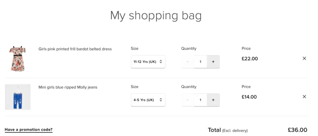
Shoppers need a reminder of the product(s) added to the cart so they can quickly check that the contents are correct.
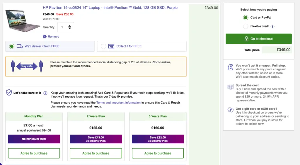
2. Price
3. Show product images
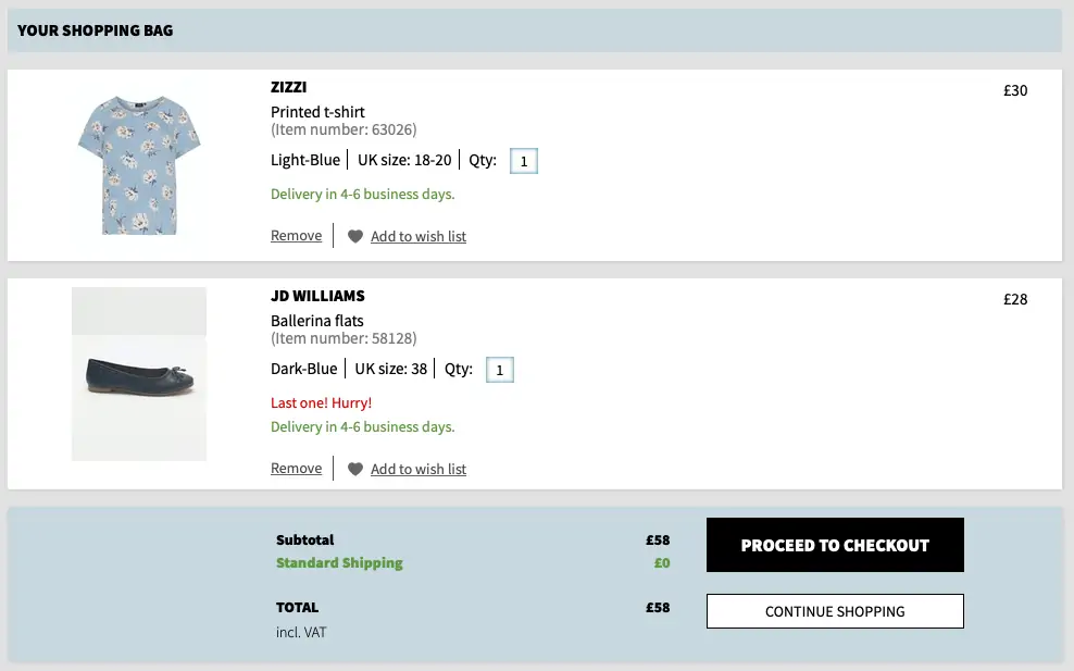
Images of products selected allow customers to quickly check that they’ve added the right products to their basket. Visual reminders can often be more effective than text.
4. Quantity and size selected
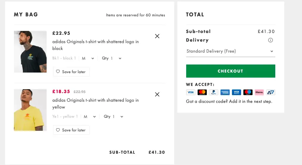
This is another key reminder to add to the basket, which lets customers check they’ve selected the right products and sizes.
5. Edit options
Allow customers to easily adjust the quantities of products added, or to quickly remove items from the basket.
6. Calls to action
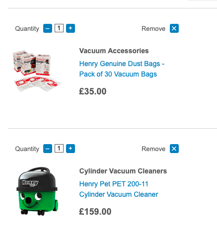
Not every customer will linger on the shopping basket page, some will just want to head straight to checkout to buy as quickly as possible.
Clear, standout CTAs help here, as they allow shoppers to see the next step to take. Clear text and contrasting colours help them to stand out.
7. Delivery and returns information
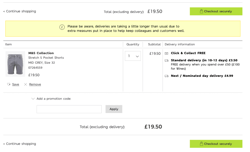
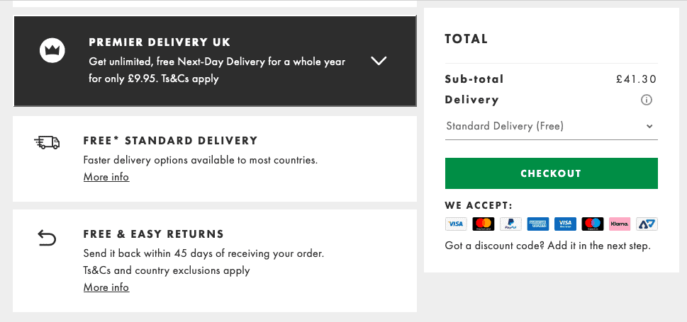
Delivery charges and timings are a key part of the customers purchase decision, so it’s important to highlight these options, or provide a clear link to this information.
8. Contact details
Showing clear contact options such as a phone number or email address allows customers to access help if they need, and can also act as a reassurance.
9. Help options
This is a stage where customers can abandon purchases. Perhaps they’re unsure about some aspects of the product or delivery, and a little assistance from customer service can persuade them to continue with the purchase.
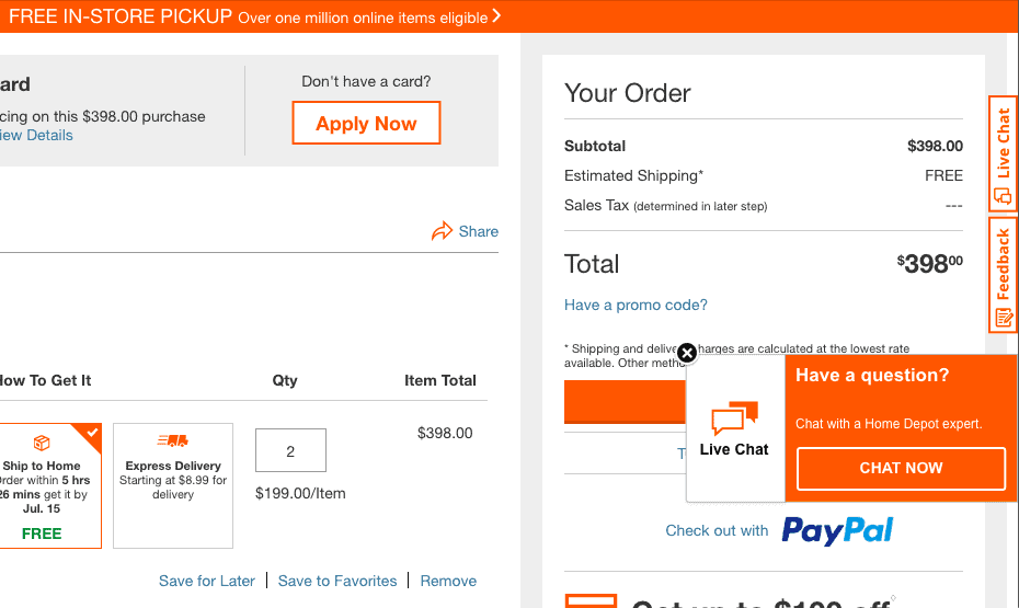
Live chat is often a good option here, as it can offer a fast response to any questions.
10. Payment methods
Highlighting accepted payment options, often using icons to show the different cards and alternative payment methods.

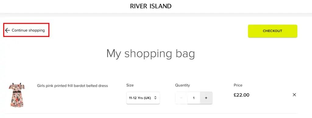
11. Link to continue shopping
Some customers head to the basket page to check total prices or details like delivery options, or perhaps because the site led them to this page after they added items to their baskets.
A subtle link to go back to the site to continue shopping helps here.
12. Promo code box
Promo codes can be a double-edged sword for online retailers.
They’re a useful promotion tool which can attract shoppers to their site, but they can be problematic on the basket page.
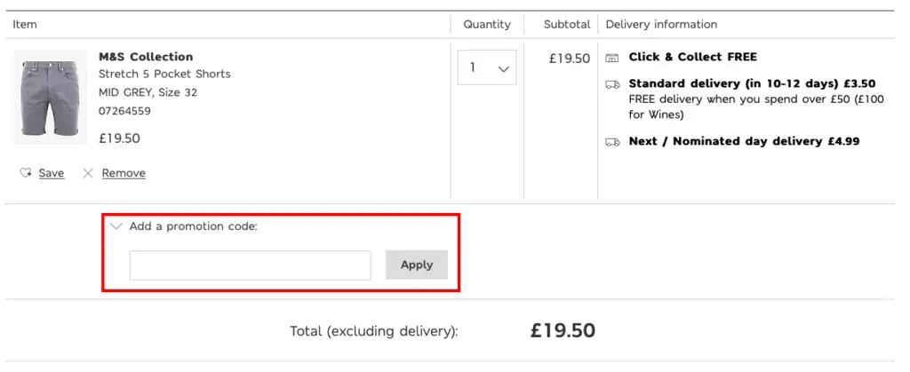
Customers with a promo code need to be able to see where to enter it, and the basket page is the best place, as it allows them to go into checkout knowing their discount has been applied properly.
However, for shoppers without a promotion to use, the box to add a code tells them that they may be missing out on a better deal. It could potentially prompt them to leave checkout to search for codes.
For this reason, it can be a good idea to make the code box less obvious so that people who are actively looking for it find what they want, while other shoppers may not notice.
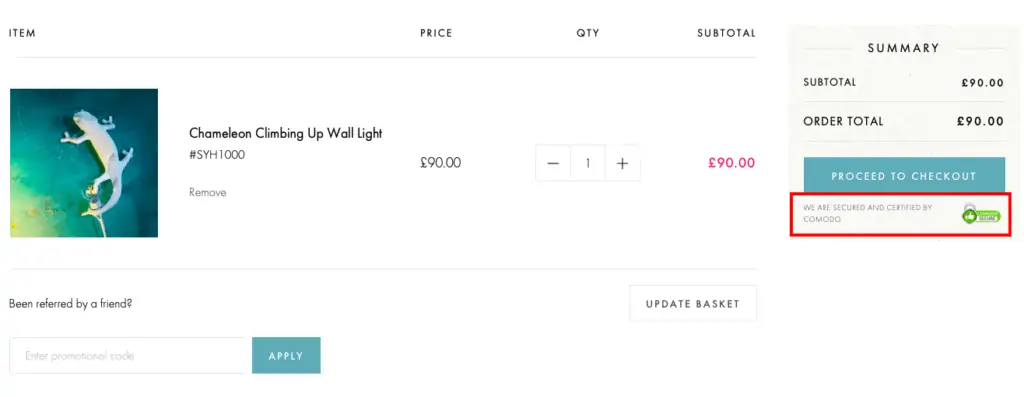
13. Security messaging / logos
This adds an extra layer of assurance for any customers who may have concerns about the security of their payments.
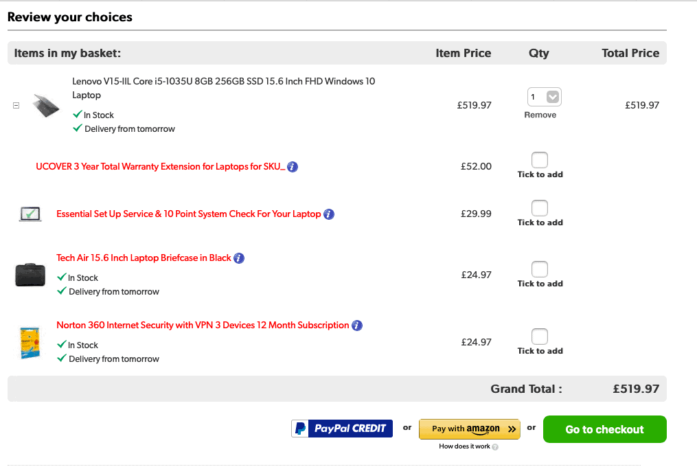
14. Cross and up selling
The basket page is a good place to show related products to persuade customers to spend a little more.
Relevant recommendations are important, such as cases, accessories and warranties for electrical products.
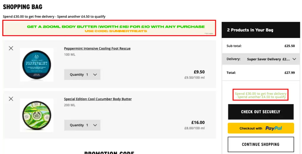
15. Highlight offers
If there is a special offer related to the products shoppers have selected, or they need to spend a little more to qualify for free delivery, then it pays to highlight this on the cart page.
At this stage, it can encourage the shopper add more items to their basket and increase order values.
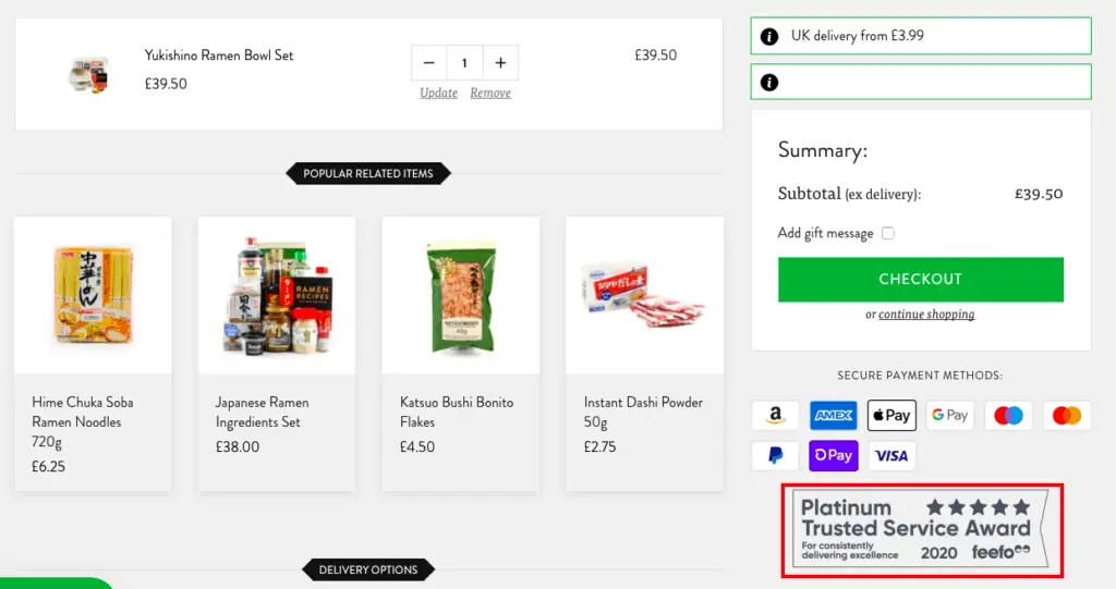
16. Reviews
For smaller retailers, or those that may be less familiar to shoppers, showing retailer reviews can offer reassurance at the basket stage.
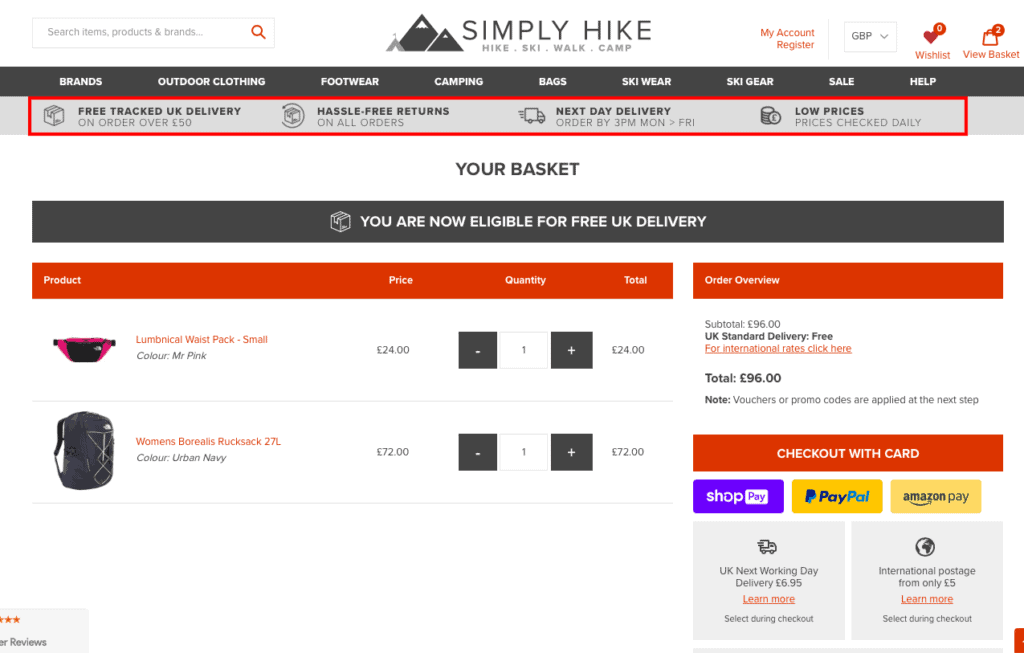
17. Persuasive messages
At this stage in the buyer journey, persuasive messaging and reminders of key selling points can help.
This could be through the USP/offer bar that is shown throughout the site, or through specific messaging on the shopping cart page.
18. Email sign up messaging
The basket page is a good place for promotional messages, though it’s important to ensure that these messages don’t deter the user from converting.
Sweaty Betty promotes email sign ups further down the basket page, with the carrot of a15% discount.

19. Alternative buying options
This isn’t a common feature, but providing an alternative way to order can help to save possible lost orders.
Navabi provides an order by phone option on its basket page, just underneath the details of basket contents.

20. Option to save for later / email basket
Some shoppers simply aren’t ready to buy, so it can pay to give them options to save the purchase for later.
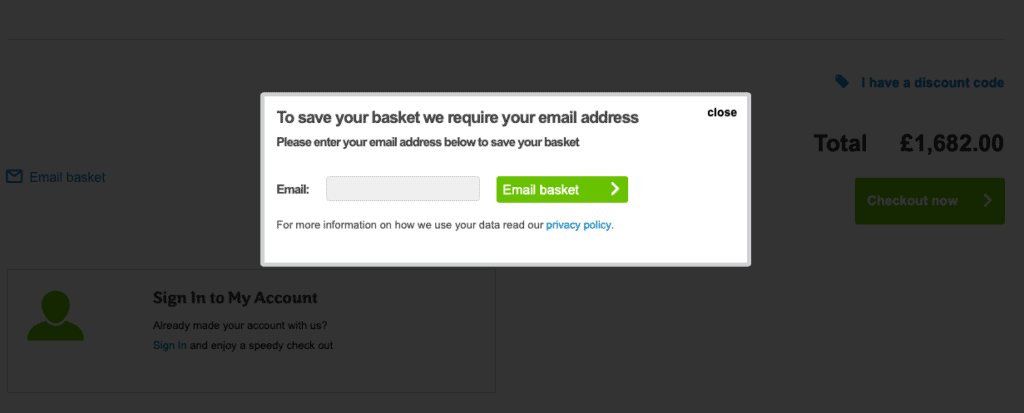
Here, AO.com provides an email basket option on the basket page. This allows AO to email and remind people about their abandoned purchase later.
21. Important messages
The shopping cart page is a good place to inform customers of any details they may need to know.
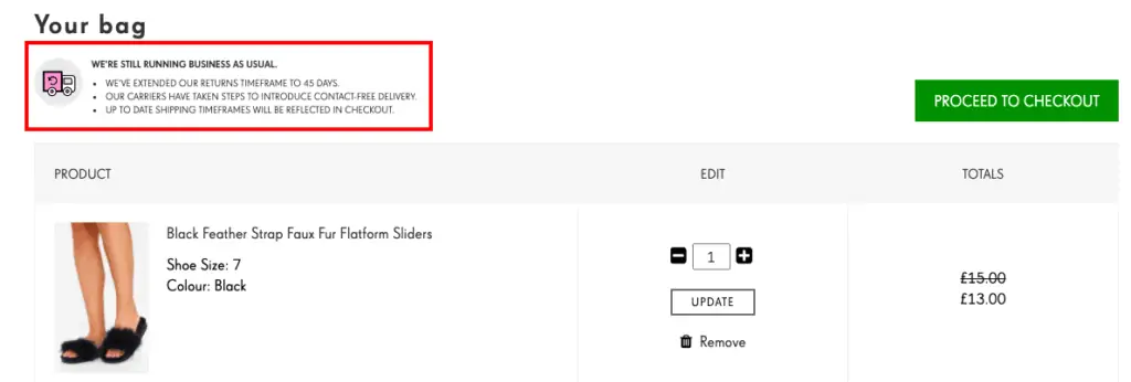
This could be messaging about delivery times during busy periods like Christmas, or nay changes in service due to the Covid-19 pandemic, as in this example.
22. Promote credit options
Many retailers offer credit options on bigger purchases, and the shopping cart page is a good place to highlight these.
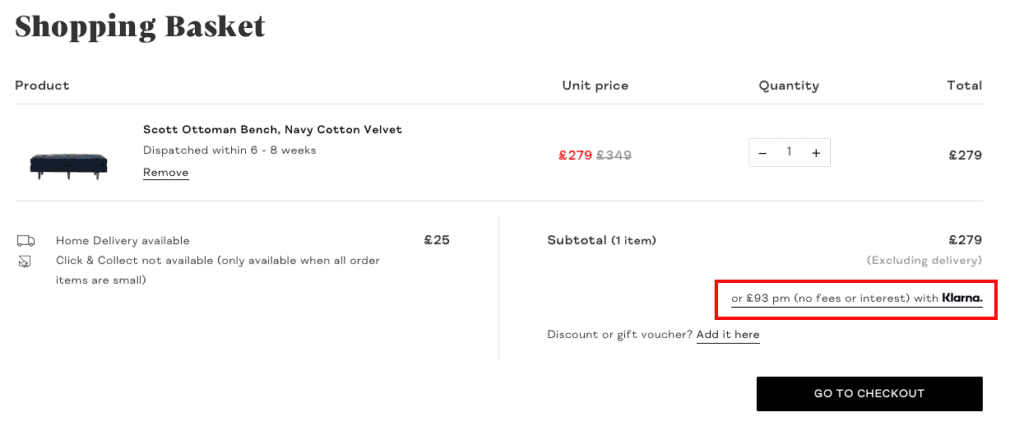
In the example above, the Klarna payment by instalment option is shown near the CTA.
