
The mega-menu remains the default method for desktop navigation on most ecommerce sites.
It’s often the best all-round solution for top navigation on desktop sites, and is especially helpful for retailers with large product ranges.
In this post, with thanks to Dan Barker on Twitter, we’ll look at some examples and best practices for the use of mega menus on ecommerce sites.
Mega menus are mainly used instead of drop-down menus, which are normally activated when users click or hover over the category with the cursor.
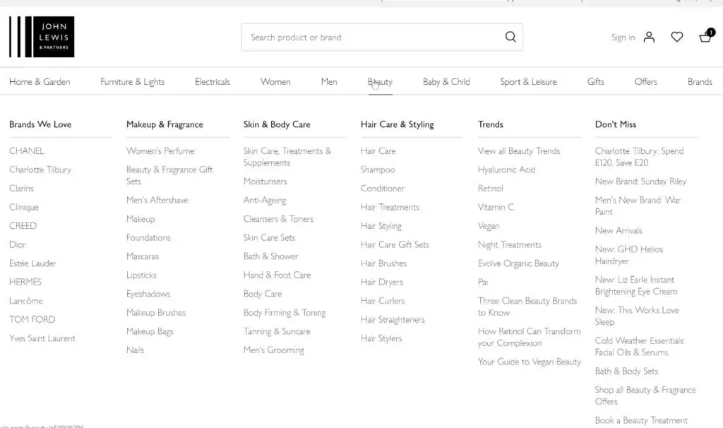
The main point is that everything within the selected category is visible at a glance, as in the example below from John Lewis.
In theory, the user benefits because they can find what they want more quickly, while for the retailer it allows them to present plenty of options without taking up too much space on the homepage or elsewhere.
Most mega-menus display much like the John Lewis example, but others use accordion style mega menus which expand from left to right as users choose each category.
Used well, mega menus are an elegant design solution which saves space while making navigation options easily accessible for shoppers.
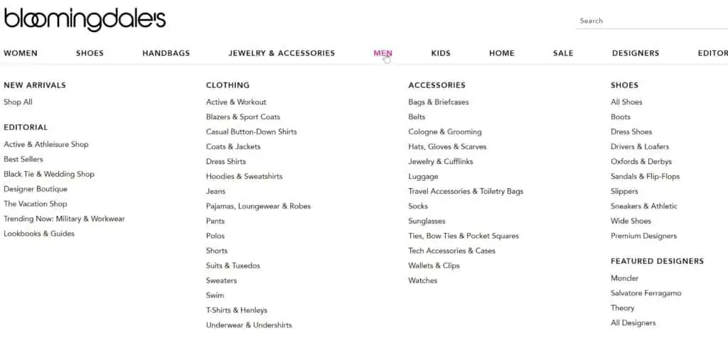
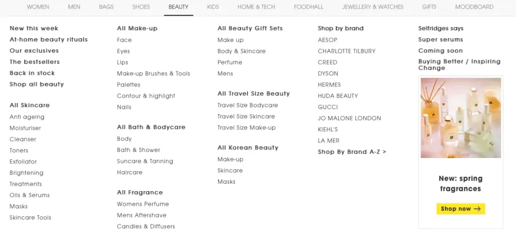
In the example from Bloomingdale’s, all options are presented at once, but are relatively hard to scan and differentiate from each other.
Contrast this to Selfridge’s, where the use of multiple heading, bold text and space makes it easier for users to scan and find the category they need.
Another thing to consider is spacing of links. They should be far enough apart that the user can click without making a mistake.
Tip 2: More is not better – Don’t add options unless they add real value
One potential problem with mega menus is that, since a lot of categories can be fitted into them, there can be a tendency to add too many options.
This can overload the user, and make it harder for them to find what they are looking for. It;is therefore important to carefully consider everything you add, and make sure each is justified.
Here’s why that’s important, according to Dan Barker:
“If you’re aware of information design principles, you’ll also be aware of how the theory of ‘cognitive load’ fits with that – ie, the general consensus that the way information is presented can make it easier/harder (increase/decrease load) for your users’ brains to process it.
This is a simplification, but – here’s roughly how you can think about cognitive load when constructing mega menus:
There are 3 basic types of cognitive load: ‘intrinsic’, ‘extraneous’, and ‘germane’.
‘Intrinsic Cognitive Load’ is the inherent load associated with a particular task or set of information. In other words, if you have 1,000 products across 25 different categories, it will always be harder for users to process exactly what you stock, how those categories fit together, and within which they may find the item they’re looking for, than they would if you had just 2 products in 1 category.
‘Extraneous Cognitive Load’ is the load you place on your users based on the way you present that information. For example – if you have a category called ‘Dresses’, and another category immediately below it called ‘Dressing for the occasion’, that may make it harder for a user to figure out where to go to find what they’re looking for than simply having ‘Dresses’. Ie, 2 links here may be worse than 1.
‘Germane Cognitive Load’ is a third type, taking into account the idea that not all cognitive load is negative – some can actually assist the user. ‘Germane’ load is the type that helps users to construct patterns, and organise categories of information. In other words, adding Germane load can actually improve the user’s ability to learn how to use your website, and find what they’re looking for – extra information that makes your navigation feel easier rather than harder.
To take the previous example, having a subtitle ‘Shop By Category’, which includes a link ‘Dresses’, and another subtitle for another section of your navigation called ‘Style Guides’, which includes a link ‘Dressing for the occasion’, helps your user to understand “Oh ok – this website allows me to shop products directly by category, so I can find all the dresses right there; but they also have some advice guides, and if I click this link it’s probably going to give me some tips on how to put together an outfit, and maybe have a few selected styles as shortcuts,” – and all from simply including a couple of extra words. Ie, you have the same 2 links as before, but by adding some ‘Germane’ load, the user immediately knows both the purpose of those links, and builds up a much better picture of what your business offers, all in a split second.
This is an oversimplification, but hopefully this idea helps illustrate how important it is to make sure your menus add value to users, rather than simply adding unhelpful load.
– from Dan Barker
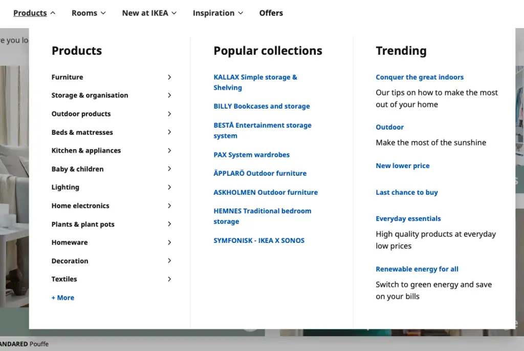
It’s also important to think about the ordering of mega menu options, and those which you want shoppers to see, which should be partly based on the data you have about shopper behaviour.
Here, IKEA shows popular categories on the left, and uses the centre of the menu to show popular collections as quick links for shoppers, as well as tribbing themes and categories on the right.
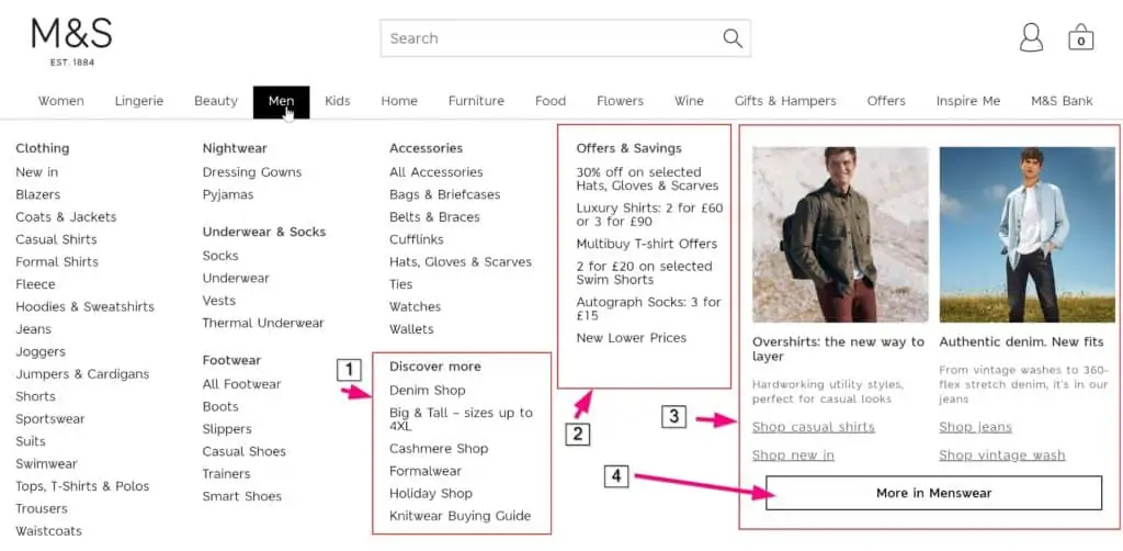
Here, M&S uses other ways to focus users’ attention. It shows:
- Pseudo categories such as the holiday shop and ‘big and tall’ .
- Highlights current offers.
- Shows current trends.
- Adds an extra catch-all ‘more in menswear’ option for those who don’t find what they want.
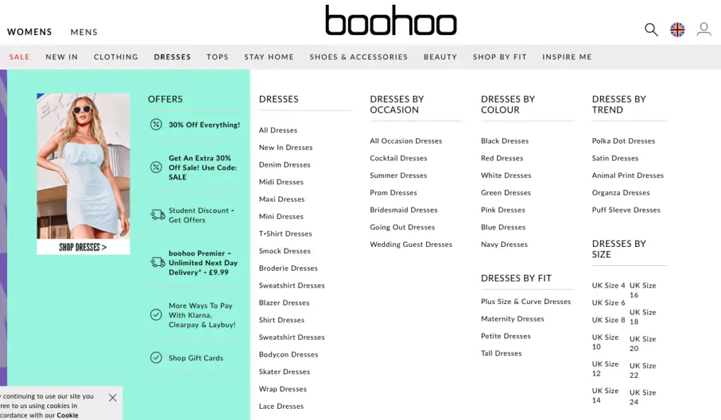
Boohoo takes an interesting approach, with one of the larger examples of meag manus. It offers a choice of different ways to navigate, with dresses by occasion, by fit,by colour, by size, and so on.
It also uses the menu to promote key USPs and offers, from discunts to delivery and credit options.
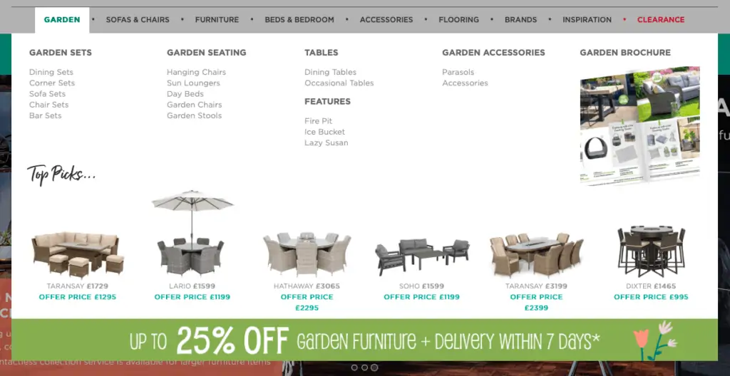
Tip 4: Use of images can differentiate your site, and your key products
Using images within mega menus can help to catch the user’s attention and add visual appeal.
In this example, images are used to highlight ‘top picks’ which really stand out from the background.
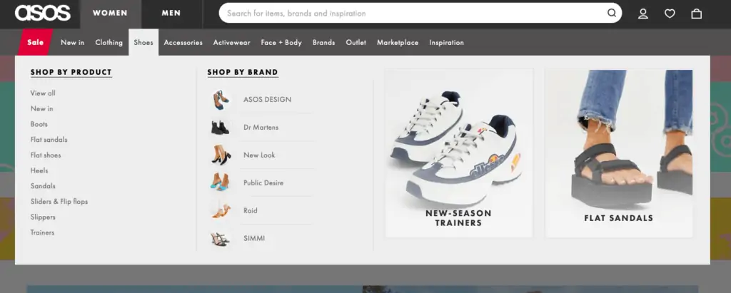
ASOS uses images effectively too, showing images from brands and key categories like new season trainers.
Tip 5: It’s fine to use different designs for different sections
Depending on the top categories which trigger each mega menu, the design of each need to change.
There may be different numbers of products under each top nav category, and different types of links to promote.
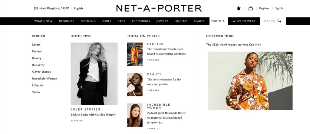
Here, Net-a-Porter uses a different layout for each section. For example, the editorial menu is more image heavy, and used to highlight recent content.
The method of triggering menus is something to think about, as there’s a risk that users can accidentally trigger menus, or also that menus can vanish too quickly if the user moves the cursor out of the menu by mistake.
To avoid the issue of accidental triggering menus, Jakob Nielsen recommends a short delay of 0.5 seconds after hover before a menu is triggered. Another option is to only trigger mega menus when a user clicks, though most retailers opt to trigger on hover.
Perhaps more important is to avoid users unintentionally closing menus, and this can be achieved by delaying the closure of the menu, or by making the menu large enough that it’s easier to manage.
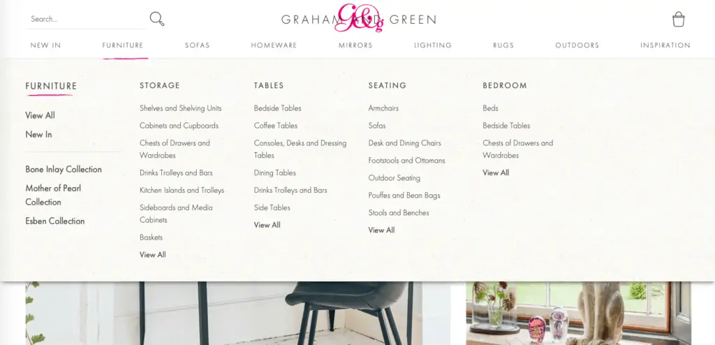
For example, the Graham & Green menu fits the full width of the homepage and has some space at the bottom, so it’s harder to accidentally move the cursor out of the menu area.
In Summary
Mega menus are a useful top navigation solutions for retailers, and can help to make multiple categories and options easily accessible for users.
However, it’s important to consider the design and presentation of menus to avoid the potential drawbacks.