Ecommerce stores can be tough to distinguish, as they all fall into the same practices, themes, and software—especially those using Shopify.
It doesn’t have to be the case with your Shopify store. There’s a hefty number of themes available in the store, third-party apps for almost any type of widget, and products available for dropshipping.
So if you’re looking for branding inspiration or ideas for elevating your customer experience, these are the best Shopify store examples that will give you the creative spark you need.
What Profitable Shopify Stores Have in Common
Every path to success is different. There are no shortcuts or infallible formulas for building a successful business regardless of the ecommerce platform you’re using.
But, there are fundamental practices that your ecommerce business must nail first if you want your store to have the possibility to grow. Things like:
- Investing in a premium custom theme.
- Refining the customer experience.
- Selling products that people are willing to buy.
- Building a brand and fostering relationships with your customers.
- Leveraging third-party apps to scale your business.
Adam Rogers—the senior content marketing manager at Shopify—knows what a successful online store looks like, as he explains:
Successful Shopify stores build trust with new shoppers instantly. They have essential pages and brand elements that inform the customer it’s a real store—with a cohesive about us page, clear returns and shipping policies, and excellent product photography.
Beyond onsite UX, the brand is consistent at all entry points of the customer, from the design of a Facebook ad to the way they write product descriptions.
Adam Rogers, Senior Content Marketing Manager at Shopify
In the end, it is all about how your customers experience your brand. It’s not about just the designs or the layouts, but how easy and appealing it is to do business with you.
Food and Beverage Shopify Store Examples
In the food niche, visuals are everything. You can’t just tell visitors that your low-cal snacks are delicious without showing them why. Here are some ecommerce businesses doing a great job in this niche:
1. Ratio Coffee
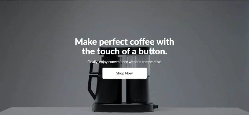
This beautiful Shopify store has a balanced color palette and a smooth scrolling system that embodies the elegance of its branding.
The video background, catchy phrases, and a simple CTA button make visitors want to be part of the Ratio Coffee community. The playful and fun articles on their website also drive qualified traffic to their store.
What makes Ratio Coffee a great Shopify store example?
- Elegant scrolling system with simple animations.
- Cohesive and on-brand color palette.
- Inspiring product pages featuring the items in action.
- Non-obtrusive email form.
- A product catalog that’s pleasant to navigate.
- Easy site navigation.
- Easy access to products and shopping carts.
- Compelling blog articles featuring their products and coffee experts.
- Customer reviews included.
- User manual for all products included.
- Simple call-to-action (CTA) button.
There’s a lot that you can say about Ratio Coffee’s website. It makes the shopping experience a pleasant experience rather than a chore, while at the same time staying true to its brand identity.
2. OLIPOP
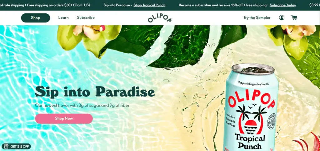
OLIPOP’s idea is to offer a new kind of soda that’s moderate in sugars but high in dietary fibers so it can benefit your gut microbiome.
Their website feels uncluttered yet colorful, fresh, and appealing. The copy explains pretty well what the soda is about, and it leverages social proof with Camila Cabello’s testimonial. Plus, the product page looks creative, and it changes color when you change the flavor.
What makes OLIPOP a great Shopify store example?
- Simple and clear layout.
- Clean yet creative design.
- Compelling product page.
- Easy access to products and shopping carts.
- Well-organized products.
- Easy navigation and shopping experience.
- Leverages social proof such as testimonials from celebrities, reviews, and studies.
OLIPOP’s website is an excellent example of how you can be creative without hurting the customer’s experience. It also teaches you how to use social proof properly without feeling like you’re hard-selling.
3. Guelaguetza
“Mole” is a sauce used in Mexican cuisine, including the famous guacamole.
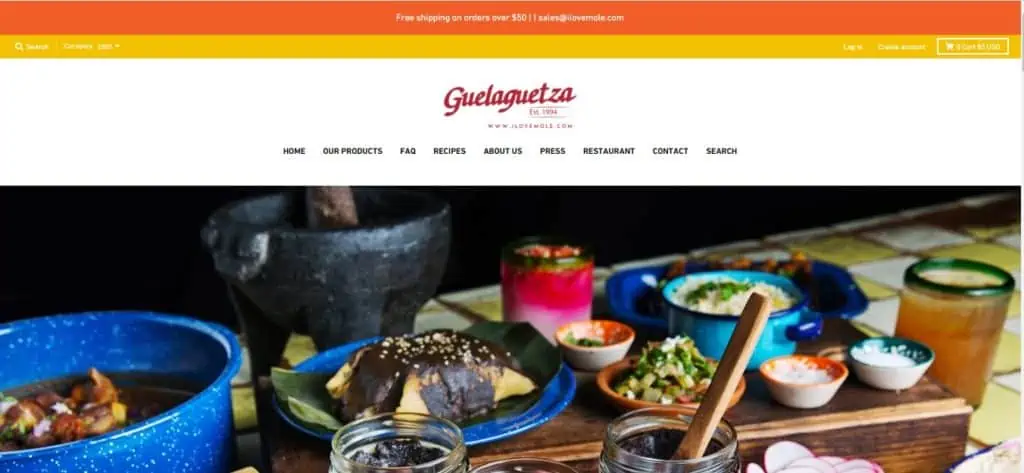
Guelaguetza pays homage to these flavourful roots through a color-infused site that packs a punch. All product images are high-quality, and they make an impression on the customer.
What’s particularly attractive here is how the homepage throws pictures of delightful dishes, simple recipes, and the ingredients at you right upfront—it makes it impossible not to want to buy a mole starter.
What makes Guelaguetza a great Shopify store example?
- Colorful visuals, including an excellent logo.
- Full-width images.
- Playful color palette.
- Inspiring “About us” page.
- Easy to navigate.
- Great “Product Reviews Section.”
- Easy access to products and shopping carts.
- A wonderful section dedicated to their restaurant, which includes a menu and the option to reserve a table.
Guelagetza’s store is an excellent example of how you can compel your visitors to buy by making them eat with their eyes.
4. Gallery Drinkware
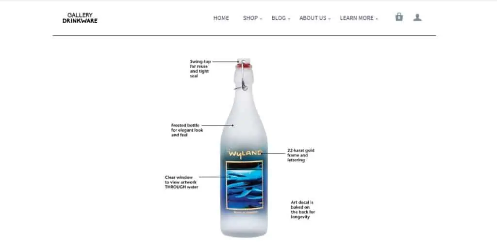
Gallery Drinkware is an ambitious art project that combines glassware craft with eye-catching designs. Not content with being only art pieces, their products also foster reusability—so you don’t have to throw plastic into the ocean.
Their website is organized in an uncluttered fashion which puts visitors’ attention on the products. Moreover, the seamless checkout process makes payment a painless experience for customers.
What makes Gallery Drinkware a great Shopify store example?
- Elegant deployable sidebar menu.
- Communicate a clear mission you can relate to.
- Multiple high-quality pictures for each product.
- Simple product pages featuring the items in action.
- Easy checkout process.
- Uncluttered interface and minimal design.
- Good product descriptions and specifications.
- Simple and effective CTA button.
- Informative and educational videos.
Gallery Drinkware has an immaculate website where it’s impossible to get lost, which makes an awesome example of how you can make your homepage more focused and minimalistic.
5. Teatox Australia

Teatox is a one-product store founded in 2013 to help people achieve natural weight loss through tea detoxing programs.
Their website features high-quality and colorful images while maintaining an uncluttered interface. The menu section has clear typography and is positioned on top of the page. Additionally, the blog section is well-organized and features appealing images.
The homepage explains why their tea reduces weight and how its active ingredients work. Plus, it features multiple bundles to choose from.
What makes Teatox a great Shopify store example?
- Unique blurb icons add a nice personal touch to the homepage.
- Their use of product images with transparent backgrounds is a small detail that reveals a knack for visuals.
- Easy access to products and shopping carts.
- Seamless checkout process.
- It’s a great example of content marketing that’s focused on educating customers.
- Well-organized blog section with appealing images.
- Product features are explained in a clear manner.
Despite having a header to cover a lot of space, Teatox’s website is very well designed. It addresses many objections and makes it easy to try the product.
Fashion Shopify Store Examples
When it comes to fashion, pretty visuals are not everything. There’s a style involved, an identity, and sometimes, an idea. Here are some great brands doing good work:
1. Rhone
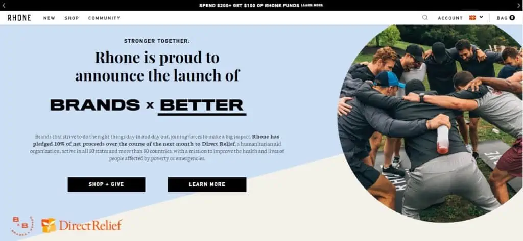
Rhone was built by a group of professionals with a passion for athletics. Its founders became discouraged by the lack of quality sportswear in the market, and decided to jump in and bridge the gap themselves.
Browsing through Rhone’s selection of products is easy and pleasant because of the high-quality images and the engaging layout. The bold font contrasts with the light-colored background and turns customers’ attention to the products. At the bottom of the page, there’s a list of publications from famous magazines where Rhone’s products have been featured.
Their style is very simple yet appealing for athletes and fitness men.
What makes Rhone a great Shopify store example?
- Bold fonts and great use of typography.
- Eye-catching and effective CTA button.
- Easy to streamline.
- Full width and high-quality images.
- Product pages have a clear layout and compelling copy.
- Well-organized product lists and categories.
- List of sponsored publications.
- Easy access to shopping carts.
- Informative and educational “Community” page.
Rhone is an excellent example of how having a proper layout, high-quality images, and the right color combination is more impactful than adding fancy visuals everywhere.
2. Bluboho
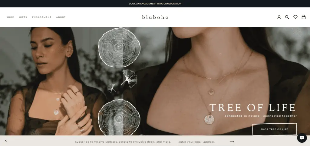
Bluboho is a jewelry store that oozes elegance—the term “refined” is even part of their tagline. It achieves this look thanks to a well-executed mix of minimalism and sleek typography.
The smooth layout and organization of the page make visitors want to spend some extra time on the website. Every collection is packed with high-quality images that give a pleasant impression of how the product might look on you. There’s a different category for every jewelry collection, making browsing through the website seamless.
What makes Bluboho a great Shopify store example?
- Simple rotating product images.
- A vast selection of categories that makes shopping simple.
- Nice and clean layout.
- Non-obtrusive email form.
- Full-width images and appealing photography.
- Elegant fonts and sleek typography.
- Easy to streamline.
- Informative FAQ page.
- Easy checkout process.
Bluhobo excels at making its products the main protagonists with a clean layout and color palette.
3. Take a Shot
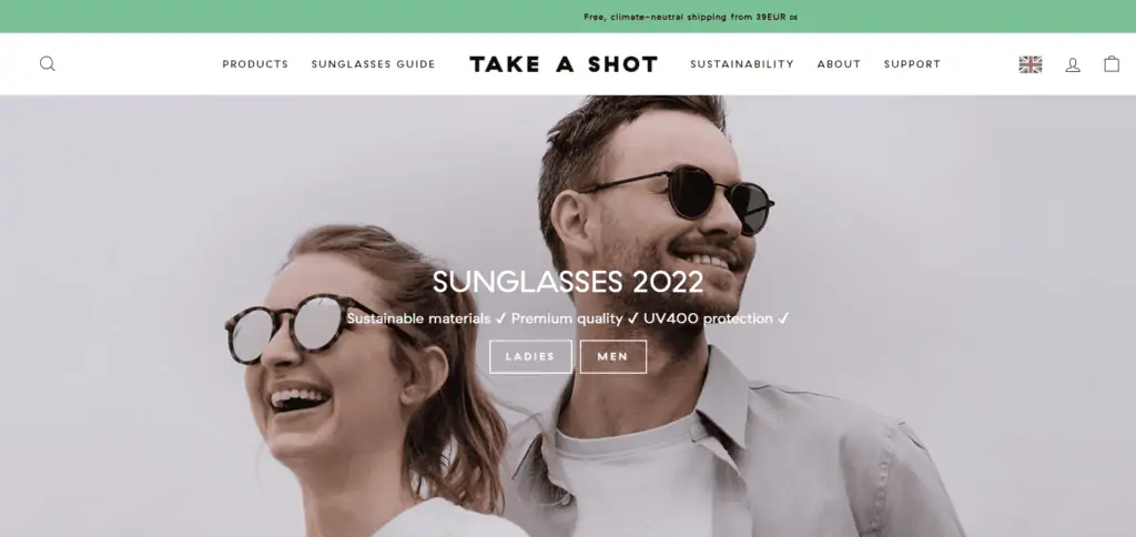
This brand is the brainchild of a group of young creatives who came together to develop a unique brand of wooden eyewear. Their products mix acetate and polycarbonate materials with bamboo, cherry, and walnut.
Every product is nicely presented with high-quality images, which helps customers imagine themselves touching the product. The easy page navigation and clear product descriptions make shoppers want to stay a little longer on their website.
What makes Take a Shot a great Shopify store example?
- A great combination of regular product images with photos of live models wearing them.
- They include sketches of the dimensions for each model, and it gives the page a whimsical touch.
- Easy access to products and shopping carts.
- Bold fonts that contrast nicely with the white background.
- Clear and informative product descriptions. Communicating all its features, who fits the product, and everything included in the product package.
- Solid promotion with videos of models wearing the products.
- Easy page navigation.
Take a Shot knows how to take photos that represent their style, which makes an inspiring example of great photography used in ecommerce.
4. Silk Laundry
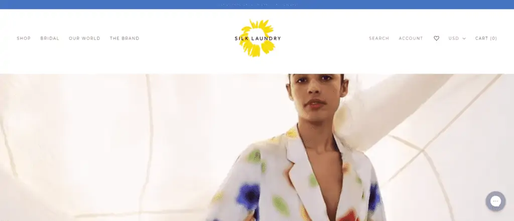
Silk Laundry is a collection of classic silk pieces for women that defy trends. All of their products are handmade, and the operation is kept small so they can devote enough time to make each piece perfect.
Browsing through Silk Laundry’s products is a pleasant experience. The high-quality images help customers envision how the product feels, and some listings show a footage of the product with smooth style.
The informative product descriptions have sleek and elegant typography. The site also has transparent “Shipping and Returns” and “Reviews” pages which build trust with the customer. And the overall structure is straightforward to navigate without clicking too much.
What makes Silk Laundry a great Shopify store example?
- A minimalistic design with gorgeous, color-filled images.
- An integrated Instagram feed that doubles as a showcase for their designs as well as user-generated content.
- Fun “Journal” page with short and informative articles.
- Cool footages of models wearing the products.
- Clear and transparent product descriptions.
- Elegant and sleek typography.
- Captivating CTA button in contrast with the white background.
- Easy access to products.
- Non-obtrusive email signup feature.
Silk Laundry teaches you how to leverage video to make each product stand out on its own and make it an appealing experience for the shopper.
5. Western Rise
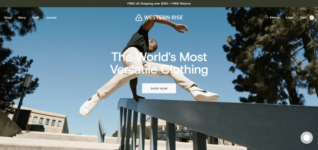
Western Rise is a clothing shop for men, and it’s all about versatile clothing that can fit any occasion.
The homepage features a dynamic full-width image that gives a great first impression. It starts presenting some of the products right after you start scrolling, showing their specifications right away and—most interesting—their use cases.
Not only that, their catalog is straightforward to navigate with simple categories. Plus, the journal features blogs that are detailed and help men know what to wear.
What makes Western Rise a great Shopify store example?
- A classic, sober design that employs typography to its advantage.
- Gorgeous pictures for each piece of clothing.
- Full-width image on the hero page.
- Product images displayed from different angles.
- Easy access to products and payment.
- Valuable and helpful blog articles.
- Nice layout and well-organized product collections.
- Embed Instagram feed.
Western Rise does a great job showcasing products in the right way. It makes it easy for the shopper that simply wants to look for more options to… see more options.
6. Outdoor Voices
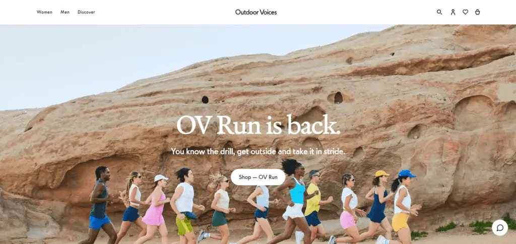
This store sells fitness clothing designed for outdoor running, athleticism, hiking, etc.
The homepage features high-resolution images featuring people running outside and hiking. The copy presents interesting ideas such as running in a dress and deja vus.
It offers clothes for both men and women. Navigating the catalog feels smooth, with many filtering options to look for the right outfit. And the product pages feature plenty of descriptive images, reviews, and Q&As.
What makes Outdoor Voices a great Shopify store example?
- Clean, light design that somehow fits the outdoors thematic.
- Great product pages with high-quality images, customer reviews, and Q&As.
- Full-width images that immerse you into running out in the wild.
- Very simple to navigate and browse products.
- Well-balanced color palette.
- Features their own events where people can attend and participate in outdoor biking, jogging, etc.
Outdoor Voices knows how to transmit the energy to go outside and do some hiking. The combination of its warm yet clean design, products, and messaging makes it a compelling idea to buy some new sets and start exercising under the sun.
Artistic Shopify Store Examples
The internet has helped the art market grow thanks to its capability of allowing any artist in the world to share their art globally by themselves. Here are some ecommerce stores supporting the art market:
1. Modern Market
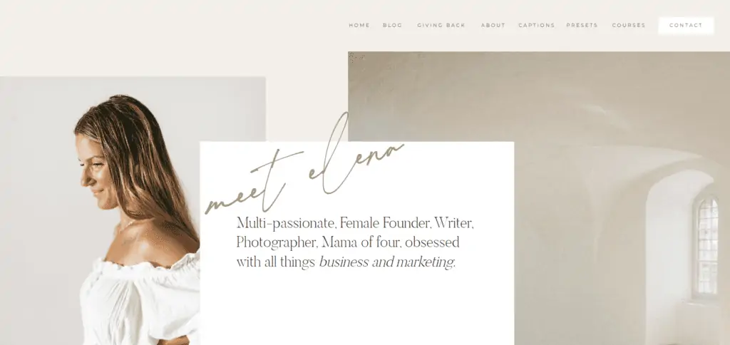
Modern Market offers a large selection of designs and tools for photographers. These include Lightroom presets, legal forms, online lessons, page templates, and more. Modern Market offers it all, and it does so without dropping the ball on its design.
The clean and minimal design of Modern Market’s website is enriched with tasteful photography.
The product pages are long. They show you what’s included in the preset, explanatory videos on how to use them, a money-back guarantee copy, lots of previews, FAQs, and also saves your money by telling you when a preset is for you or not.
The website is committed to getting the right product for the right customer.
What makes Modern Market a great Shopify store example?
- A clean, minimalistic design based on pastel colors.
- Extensive yet fantastic landing pages for each product.
- Full-width images and tasteful photography.
- Easy access to products and shopping carts.
- List of publications sponsored.
- Informative and educational videos.
- Fun and informative blog articles.
- Balanced color palette.
- Easy to streamline.
- Plenty of resources for photographers.
Modern Market offers so much value to the customer that it makes you feel like you’re cheating. This, without mentioning how the website is so well-designed that reading and learning from it is a painless experience.
2. IDRAW
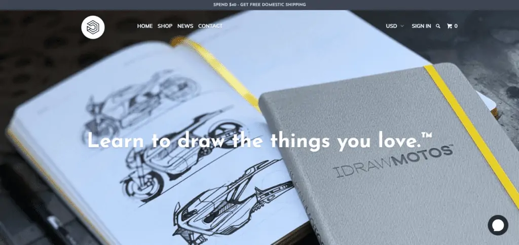
IDRAW offers a collection of high-end sketchbooks custom-made for artists of all types. They offer sketchbooks for comics, designs for cars and shoes (seriously!), and manga. Each of their products includes industry reference materials for their specific purposes.
The website is pleasant to navigate, and it’s packed with full-width, high-resolution images—it convinces any visitor to explore their artistic talents and buy a sketchbook.
In contrast with the background, the bold typography captures customers’ attention and makes them excited to learn more about the products. And since their catalog is plain and straightforward, it doesn’t miss the opportunity to present them right up front on the homepage.
What makes IDRAW a great Shopify store example?
- The IDRAW homepage is all about the sketchbooks, and it makes its products the protagonist (in a good way).
- Integrated Instagram feed showing social content and user-generated content.
- Full-width images and tasteful photography.
- Bold and sleek typography.
- Balanced color palette.
- Informative product descriptions.
- Easy access to products and shopping carts.
- Easy-to-use and intuitive interface.
IDRAW is committed to helping designers improve their drawing skills, and it shows. With such a captivating website and attractive products to offer, IDRAW is an excellent inspiration for online stores with fewer products.
3. Rokos
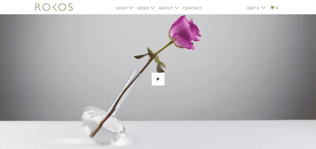
Rokos features a collection of strange sculptures that do the unexpected. Their homepage, much like some of their products, features some unique design choices that pay off unexpectedly—with no copy on the homepage at all, just images and videos.
In the header, there’s a drop-down menu for every page category, which makes browsing through the website seamless. With full-width images and sleek typography, Rokos is organized in a clutter-free manner, making visitors want to stay longer on the website and learn more about its intriguing products.
What makes Rokos a great Shopify store example?
- An intriguing homepage header that’s among the best you could ever see.
- Has the audacity to include no copy on the homepage.
- Great use of parallax effects throughout the site.
- Full-width images and tasteful photography.
- Great use of videos showing how the products are made.
- List of publications and testimonials.
- Easy-to-use and uncluttered interface.
- Balanced color palette.
- Clean and smooth layout.
- Easy access to products and shopping carts.
Rokos uses images and videos to their extreme capacity to showcase their brand, as no words would be able to express their art. It is an inspiring example for artists who want to share what they have and make some profit with it using Shopify.
4. Pop Chart
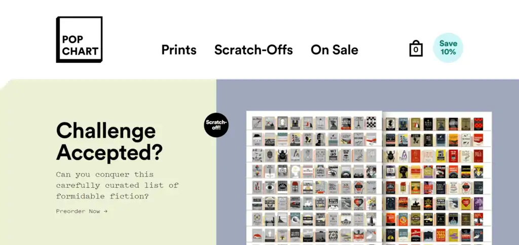
Pop Chart is an online printer dedicated to the highly-specific craft of rendering data in charts and infographics.
They offer hundreds of products, including their famous charts, stationery, and wall decorations. Check their cosmic exploration coffee charts. It summarizes an insane amount of work in a piece of art that you can enjoy while taking your coffee.
If you look at their website, you’ll see how the bold typography matches the aesthetic of their products, how smooth the navigation is, and how compelled you’ll be to buy something for your living room.
What makes Pop Chart a great Shopify store example?
- It shows many products on the homepage without making it feel cluttered.
- Pleasant navigation.
- The white background helps the products stand out.
- Bold and unusual typography.
- High-quality images mixed with original graphics.
- Easy access to products and shopping carts.
- Transforms pop culture knowledge into compelling and attractive art.
Pop chart’s site is an excellent example of how to display lots of items per page without cluttering. This, by using little spacing between items and compact typography—making it a great inspiration for website designers and artists alike.
5. Tattly
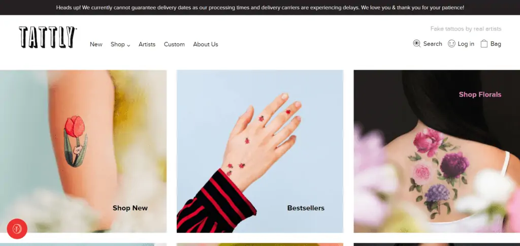
Tattly is a rising brand devoted to creating temporary tattoos. They have plenty of design options and an extensive team of artists constantly producing fun and playful tattoos for both children and adults.
The informal typography on their website matches the brand’s aesthetics, and the homepage introduces a lot of products and categories right upfront for a seamless user experience.
What makes Tattly a great Shopify store example?
- Playful typography.
- Creative and joyful design that fits its branding.
- Its brand fits both children and adults.
- Drop-down menu.
- Plenty of categories to navigate.
- Option to filter products.
- Fun and concise copywriting.
- Intuitive interface.
Tattly does a great job targeting both children and adults who want a temporary tattoo They even hire real tattoo artists to give it as much dedication as possible. Giving it a style that could feel appealing to any audience.
Pets are always trendy on the internet, so there’s no doubt that there are great Shopify stores targeting pet owners. Here are some examples:
1. Modkat
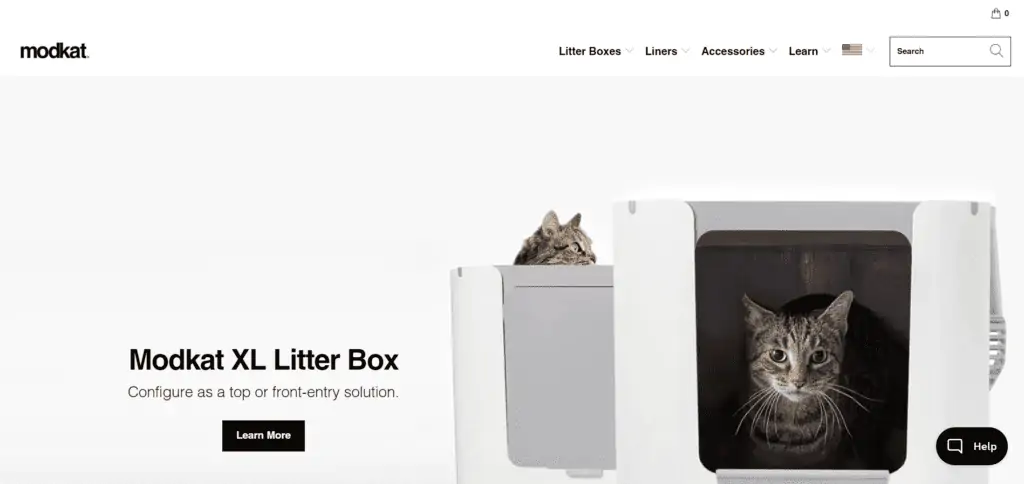
Modkat is a Brooklyn-based company that strives to solve cat owners’ worst issue: cat litter on the floor.
The minimalistic and easy-to-navigate website makes their modern litter box stand out with high-quality images. Modko’s collections are easy to browse, every product is described in detail, and the checkout process is seamless. There’s no way you can get lost here.
What makes Modkat a great Shopify store example?
- A modern, almost ‘antiseptic’ looking design that matches their product idea.
- Intuitive and uncluttered interface.
- High-quality images.
- Nice and clean layout.
- Informative product descriptions.
- A drop-down menu that features product images.
- Informative and transparent FAQ page.
Modko’s website is clean, not for the sake of it, but because it also matches their branding and idea of having a cleaner living room.
2. Zee.Dog
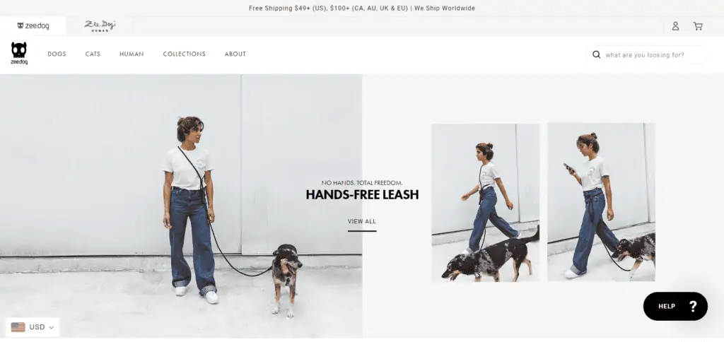
Zee.Dog focuses on leashes, harnesses, collars, and toys for dogs and cats—and humans (regular human products).
The homepage features plenty of categories for your pets, such as dog leashes, plushies, bowls for cats, etc. The layout is designed to not feel too overwhelming for the visitors, giving enough space between images and sections for you to judge before clicking.
What makes Zee.Dog a great Shopify store example?
- Fantastic product categories and homepage design.
- A sleek widget that provides customers with handy size charts and a live chat option.
- Well-placed layout that feels smooth and easy to explore.
- Easy access to products and shopping carts.
- Clear and concise website copy.
- Eye-catching CTA button.
- A drop-down menu with clean typography.
Zee.Dog offers a great diversity of products without making it hard for visitors to explore it. It has a lot to offer, but it can present the catalog in a pleasurable way.
Home Decor Shopify Store Examples
Everyone invests in home furniture, the demand is there, so ecommerce businesses in this niche aren’t rare. Therefore, here are some great examples of home decor stores:
1. Hauser
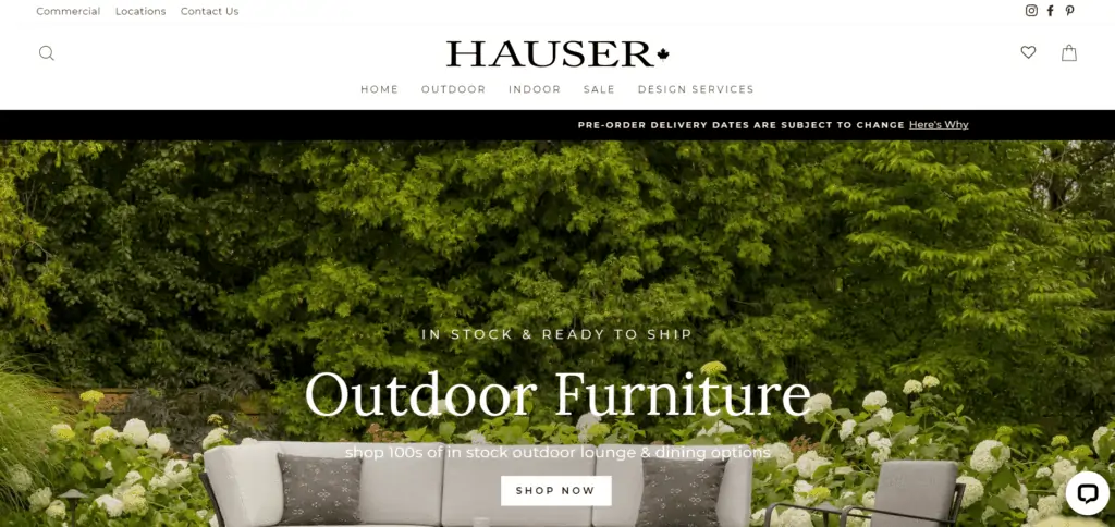
Hauser is a Canadian online home decor store committed to providing high-quality house furniture for both indoors and outdoors.
The website has a drop-down menu that fleshes out multiple categories and makes the browsing experience super smooth. Hauser’s catalog is extensive, so including this type of layout makes the difference between a visitor that leaves after being overwhelmed and a visitor that buys.
Besides, the design is as clean as the products they’re trying to sell. With high-res images, concise copy, and plenty of white space, the site makes shopping an enjoyable experience, which makes sense, given that most homeowners want their place to feel pleasant.
What makes Hauser a great Shopify store example?
- Excellent drop-down menu that makes shopping a breeze.
- Full-width and high-resolution images.
- Big, bold fonts and elegant typography.
- Captivating CTA buttons.
- Easy checkout process.
- Live chat messenger.
- Clean design with enough white space.
- Presents the products in the right place and time.
- Encourages to explore categories instead of individual products.
If you have an extensive catalog, Hauser is the ultimate example of how you should categorize your products and elevate the shopping experience for your customers. The layout of its menus, its categories, its images, its fonts… They’re all key factors that will make the difference.
2. Hobbe
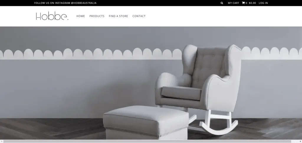
Hobbe is a minimalistic store from Australia that only sells rocking chairs. It’s the brainchild of a mother who decided to bring her vision to life when she couldn’t find a suitable rocking chair for her own use.
Hobbe’s minimal and clean layout is in line with the aesthetic of their rocking chairs—rocking chairs that look fashionable but are also comfortable.
The homepage has little to no copy. It only shows a carousel of full-width images featuring a rocking chair along with a baby bed that fits the style. This way, visitors would simply shop with their eyes and click on a chair they like to see the product page.
What makes Hobbe a great Shopify store example?
- A sparse, modern design that gives an upscale feel to the store.
- Excellent product photography that brings the chairs to life.
- Clean and appealing layout.
- Sleek typography.
- A simple white background that empathizes the products.
- Intuitive and uncluttered interface.
- Informative product descriptions.
- Seamless checkout process.
Hobbe teaches you how to sell products with a very minimalistic website and leverage high-quality photography to incentivize sales.
3. La La Land
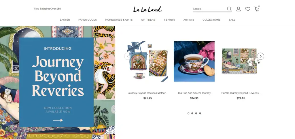
La La Land is an online store (not a movie) that sells furniture, including home decorations, stationery, wall hangings, and even clothes from independent labels.
The shop has a very colorful style that appeals to a younger audience. La la land’s collections—despite having too many categories—are easy to browse, and the centrally placed homepage header makes moving through the website painless.
What makes La La Land’s a great Shopify store example?
- A colorful, young design.
- A drop-down menu with clean typography.
- Easy access to different collections and products.
- Easy to streamline and navigate despite selling too many types of products.
- Fun and informative blog articles that incentives visitors to engage with products.
- A white background that emphasizes the colorful products and designs.
If you thought that home decor was a plain and boring category, then La La Land shows you how you can make it feel alive and sell multiple types of products without losing your identity.
4. Ivory & Deene
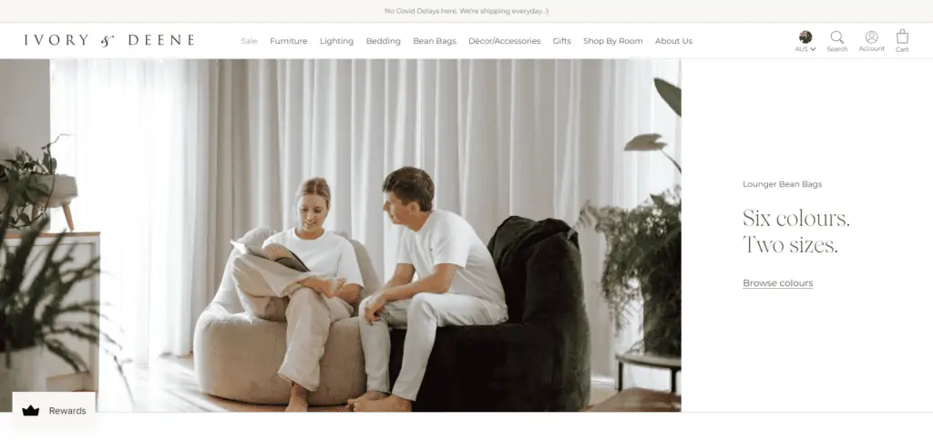
Ivory & Deene is an upscale home decor store that’s heavily invested in helping Australian charities.
When they’re not helping save the world, the team focuses on selling all kinds of furniture and decorations, including exclusive products such as chandeliers.
The website has a lot of white colors, product collections are easy to browse, every item is represented with several images, and the checkout process is seamless. The full-width banner is in line with the store’s aesthetic, and it makes navigating through the store a painless experience.
What makes Ivory & Deene a great Shopify store example?
- An elegant, uncluttered design.
- Intuitive interface and menus for easy shopping.
- Sleek typography and white colors.
- High-quality product images.
- Non-obtrusive email form.
- Embed Instagram feed.
- Image-driven product pages with a seamless checkout process.
Ivory & Deene is elegant, has a lot of white colors, and makes the shopping experience as intuitive as possible. You can learn a lot from navigating their site.
5. Floorplan
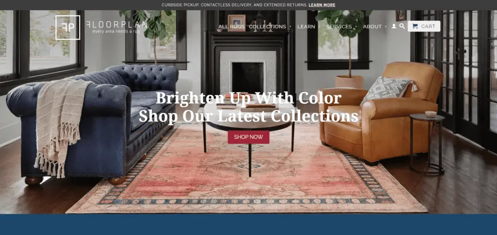
Floorplan is a store that only sells rugs and a few accessories. They include cleaning and repair, local delivery, and even custom rug designs.
Their passion comes from a long historical tradition and their belief that a great rug is a perfect item to tie a room together. Thus, Floorplan uses a colorful website design and bold typography to attract customers who want to shop more than a plain carpet.
What makes Floorplan a great Shopify store?
- Great use of calls to action on their product pages.
- Simple drop-down menu.
- Colorful palette and high-quality images.
- Easy access to products and shopping carts.
- Simple navigation.
- Non-obtrusive email form.
- Unique collections spread across their site.
Floorplan is an excellent example of how you can double down in one niche and express your passion with a website. Take a look at it if you’re passionate about what you’re selling.
6. Haus
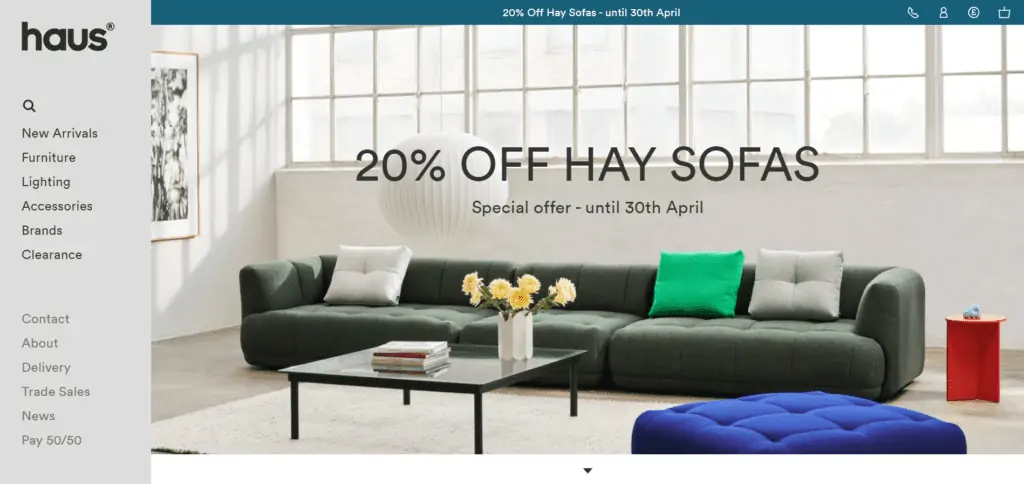
Haus is a home goods business that uses full-width images to emphasize every item in its store while giving colors to its pages.
The side menu makes browsing through product selections super easy, allowing visitors to conveniently find their path to the desired item. The visual stimulation, bold fonts, and easy navigation make visitors want to spend some extra time browsing through Haus’ products—and they made it.
What makes Haus a great Shopify store example?
- Gorgeous product photography.
- Unconventional yet appealing side menu that makes navigation painless.
- Video backgrounds.
- Full-width and high-quality images.
- Bold fonts.
- Flexible product grid.
- Easy-to-browse product pages.
- Seamless checkout.
Haus’s website features quality in its products. With optimized experience, great design, and appealing products, it deserves to be a source of inspiration for other business owners.
7. Brosa
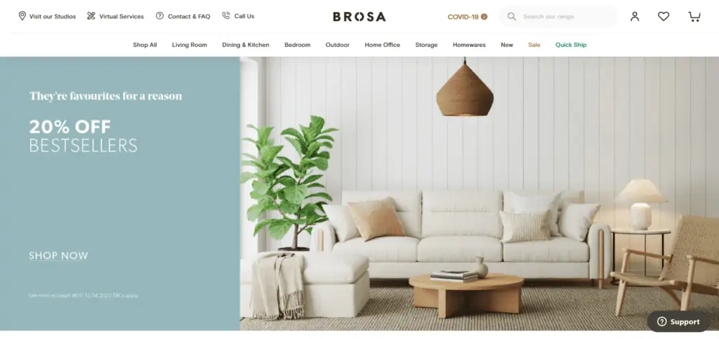
Brosa is a modest design studio with an ambitious dream: to create beautiful furniture at accessible prices.
To achieve this, they decided to go with the traditional middleman structure, selling their products from their own store.
Brosa uses high-quality and full-width images to bring products to life and drives online shoppers into the purchase path by placing captivating CTA buttons. The centrally placed homepage header makes browsing product selections super easy. And their product pages are full of detailed images, video demonstrations, FAQs, and customer reviews that help make an informed purchase decision.
What makes Brosa a great Shopify store example?
- Mobile-first design.
- Vibrant color palette and high-quality design.
- Central homepage header for easy navigation.
- Striking CTA buttons.
- Full-width and high-quality images.
- Minimalistic and straightforward typography.
- Details product pages showcasing product footages, high-quality shots, and insightful reviews.
Brosa is a complete online store that does everything well. It has excellent design, well-balanced colors, intuitive menus and layouts, persuasive copy, videos, and in general, an outstanding shopping experience for the customer.
How to Find Shopify Stores
The mind is tricky. Sometimes, a curated list of examples isn’t enough to spark inspiration or to truly represent how an online store should look—it can be very subjective.
If this is your case, there’re multiple ways to find more Shopify stores. Some of them make it easy to find successful stores. Others make it more likely to find generic websites with no substance at all. They include:
- Shopify’s founder stories. This is a Shopify’s blog section where founders share their personal story using Shopify to grow a successful brand. There’s a lot to get inspired from, and a good success story might add value to you as a business owner.
- Google. Believe it or not, there are many creative ways to Google for Shopify stores. You can simply search for more Shopify examples to find more blog posts that aren’t better than this one, or you can use features like “inurl:.myshopify.com ‘keyword’” to find stores with specific keywords in it.
- Builtwith. If you want to find ALL Shopify stores, Builtwith a site where you can see internet data and analytics, including websites using specific platforms (like Shopify). You can get access to a whole list of stores and organize them the way you want.
- Social media. Platforms like Pinterest, Instagram, or Facebook make it easy to find brands. Use their search functions to look for products, and it won’t be long until you find a brand. The caveat is that you can’t tell if they use Shopify or not.
However, if you find an ecommerce store you like on social media, you can verify whether it uses Shopify or not.
The technical trick is to right-click on the website and hit “Inspect”, then go to the “Console” tab and type “Shopify.theme” in the typing box. It will show you their current theme version, which will not only imply it is a Shopify store but also tell you the theme version they’re using.
So given these methods to find Shopify stores, it shouldn’t be a problem for you anymore to find more great examples!
Steps to Setup a Shopify Store in Minutes
If these Shopify website examples got you motivated to open your own business. Shopify makes it extremely painless to launch it on a weekend (depending on your ambition).
Here are the basic steps to launch a Shopify store:
- Create an account and name your store. Simply go to Shopify’s website, and register with your email address and your store’s name. It will do all the job and the next page you’ll see will be a dashboard where you can get started.
- Add products. You can add products one by one or in bulk with a .csv file. You’d need to include images, titles, descriptions, prices, variants, tags, etc.
- Select a theme and build your store. To create the actual website, you need to choose a theme version that fits the style you’re looking for. Shopify offers multiple free themes in the store, but the most elegant, flexible, and good-looking will be paid (so be aware of that expense). However, with the right theme, you’ll be able to create websites as great as the examples we covered.
- Add your domain name. If you like what you’re building and want to take the next step, choose the domain name for your website (you’ll need to purchase the plan to do it).
- Set up sales channels. Shopify allows you to sell your products on Facebook, Instagram, the Shop app, Wholesale platforms, etc. So take a look at the sales channels available and choose those that will fit with your marketing strategy.
- Install third-party apps. Most of Shopify’s potential comes from its app store. Essential tools like email automation, CRMs, and analytics are only available from there. So, research and list the tools you’ll need to manage your business and install them.
- Launch and start marketing. Finally, make your store public and start your business. After that, you will spend most of your time on marketing, so learn everything about ecommerce marketing.
Shopify gives you a 14-day free trial that’s more than enough to build your online store and launch it with all your products. So there’s virtually no risk in trying it.
If you want to learn more about Shopify, check this review guide for more detailed tips.
FAQs About Shopify
Do Big Companies Use Shopify?
Yes. They use Shopify Plus, which provides a customized service for enterprises that want to expand their online presence.
How Much Money Do You Need to Launch a Shopify Store?
Shopify’s subscription can go from $30/month to over $2,000/month, depending on the size of your business.
But like any other business, more costs can come with it, including:
- Added costs to the subscription when upgrading.
- A premium theme version to build a truly professional website.
- Paid third-party apps that will be essential for managing and scaling your business.
- Shipping logistics costs (even if you’re doing dropshipping well).
- Shopify Payments fees
- Paid ads and marketing campaigns.
If you’re on a limited budget like most people are, then go over all of these costs before committing to using Shopify.
Is It Worth Opening a One-Product Store with Shopify?
Yes, it’s possible, and there are many examples of Shopify stores with only one product.
What Kind of Shopify Stores are Successful?
If there were a formula for being successful, everyone would be.
Now, there’re a few things that every successful online store has in common, such as:
- Product-market fit and making sure that you’re selling products that people want to buy.
- Heavy investment in marketing and advertising to expand your visibility.
- Consistent brand-building to foster relationships with your customers.
- Top-notch customer experience that makes shopping painless.
- Compelling website design that attracts your target audience.
It is essential to nail the fundamentals before thinking about chatbots, Facebook ads, social media, or any other tactic—this way, your business will scale and grow.
Examples Are Great, But Won’t Drive Results for You
Any Shopify store can distinguish itself from its competition. All you need is the right inspiration to spark great ideas—however, examples can only do so much.
You’ve gone through 25 Shopify websites to take inspiration from, but that alone won’t make you grow—you must take action.
So, as a next step, check out other ecommerce guides for improving your store and growing your business, such as:
- How to Set Up Your eCommerce Store on Shopify.
- What is Ecommerce?
- Ecommerce Upselling Guide
- 9 Ecommerce Personalization Tools for Tailoring Shopper’s Experience
Do you have your own examples of inspirational Shopify stores? Share them with us in the comments section below.
